
Sailor Yurameku Date Gokoro: A tale of two colors, or: WTF?
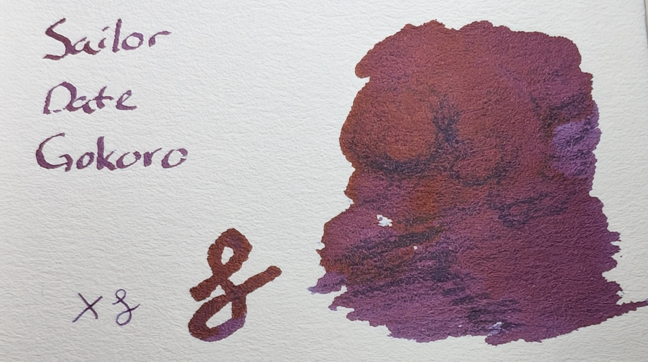
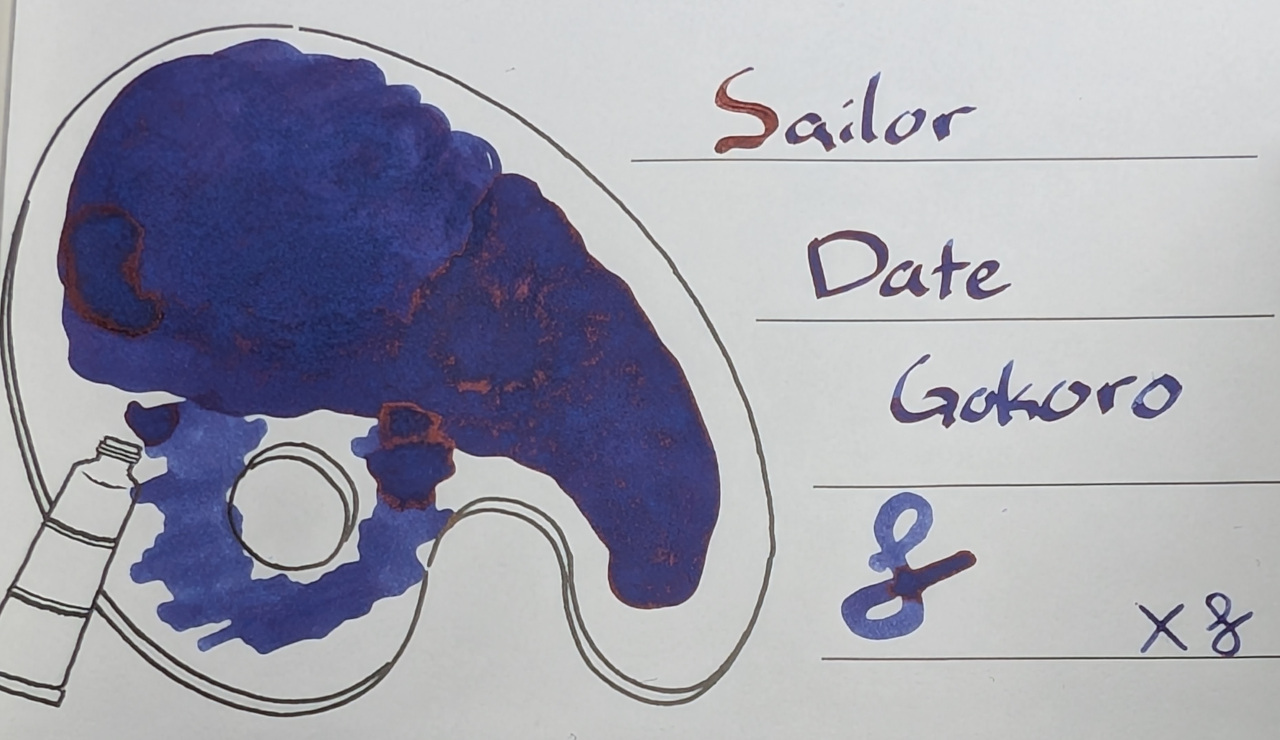
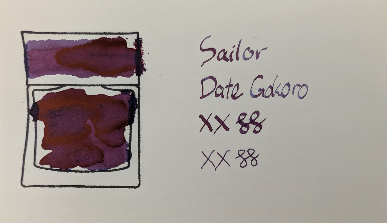
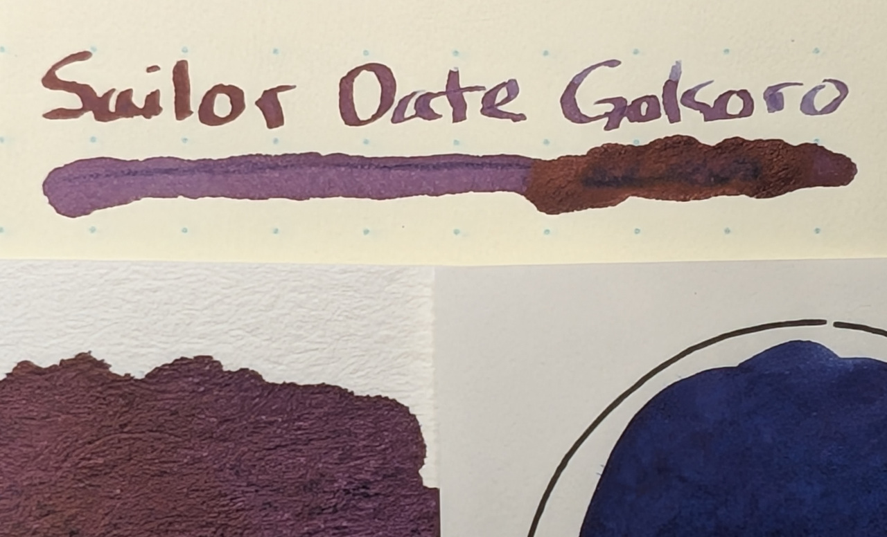
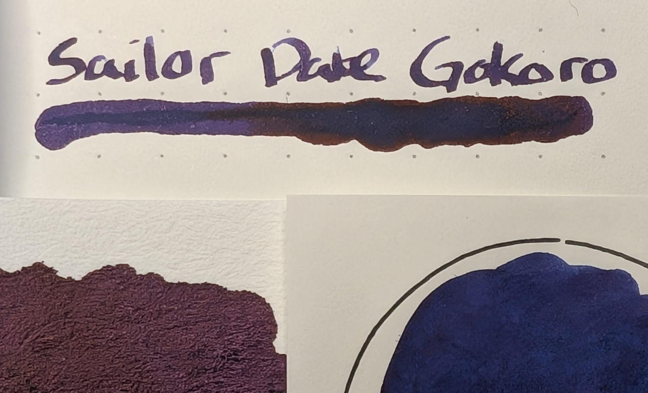
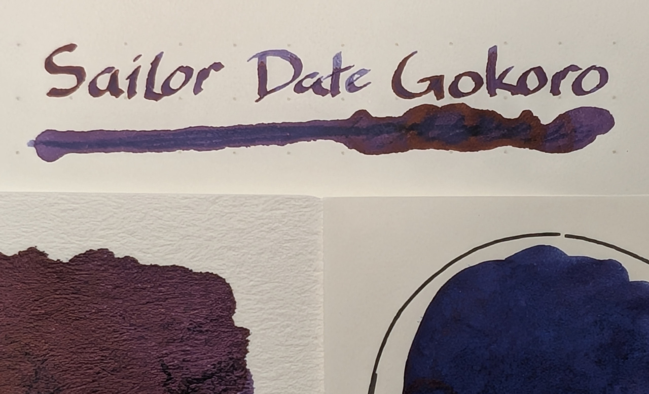
Yes, this is the same ink swatched the same way. Not only does it look like a completely different base color, the sheening looks different as well. I like both, thankfully.
Scans
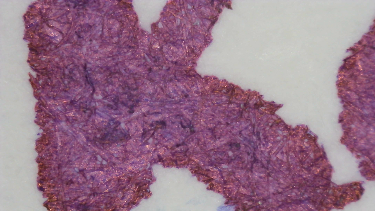
On Col-o-ring it looks purple with a lot of red sheen, even in the scan. On Iroful the ink looks dark blue. On MD it’s much more purple.
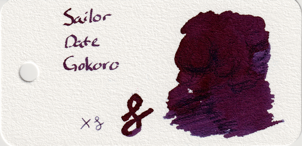
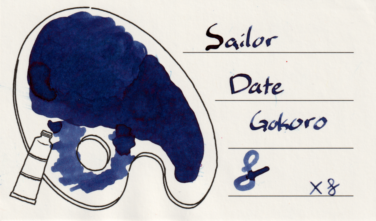
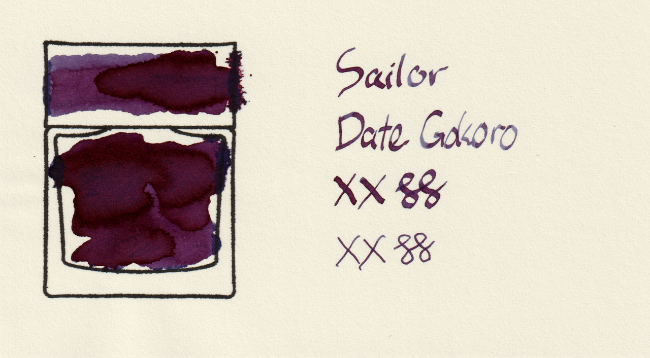
The shading on MD makes it go between violet and plum, which is another significant shift.
Photos
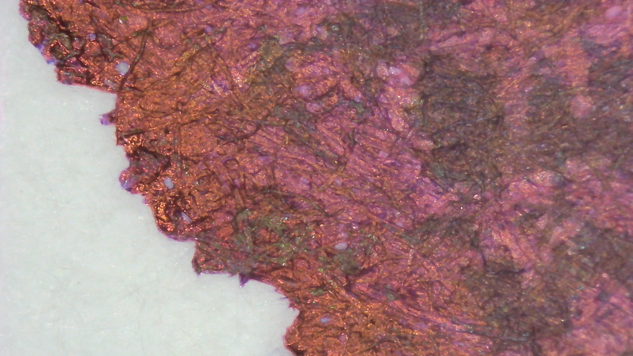
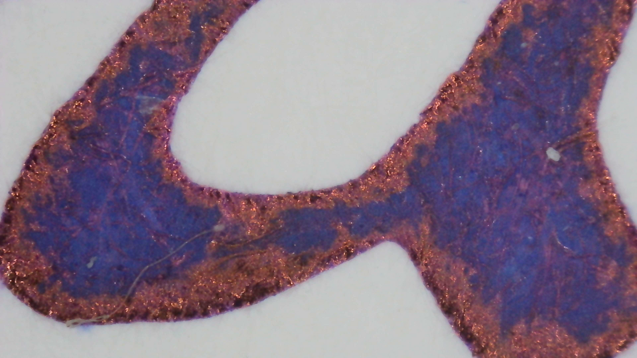
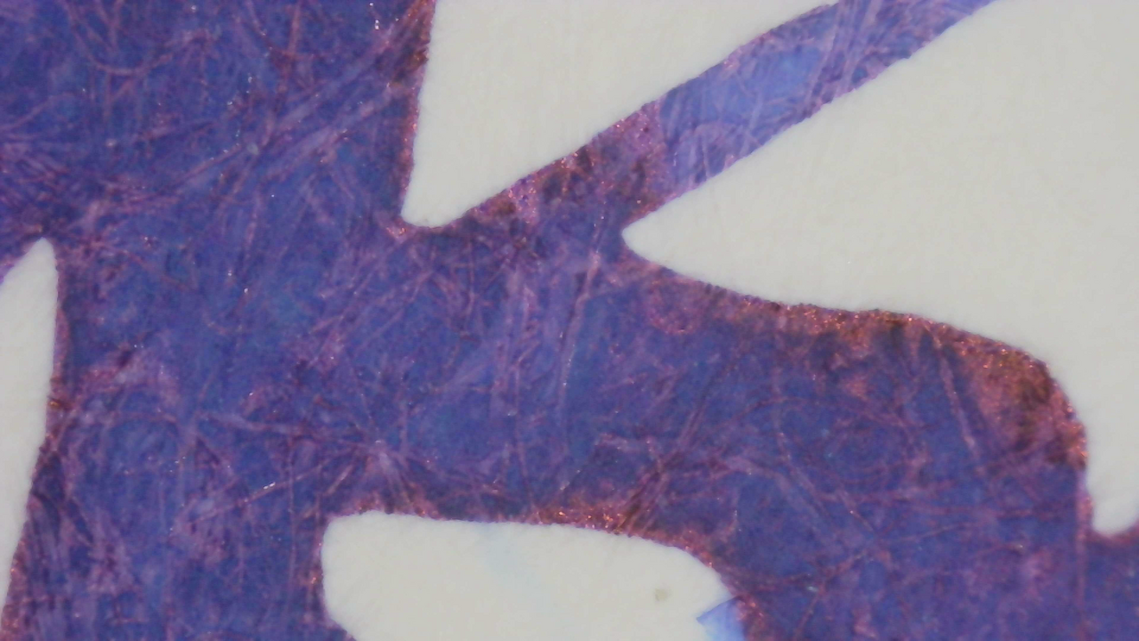
More sheen shows on the photos. On Col-o-ring it looks purple with a lot of red sheen. On Iroful the ink looks dark blue with a little red sheen. On MD it’s much more purple with less sheen.
Comparisons
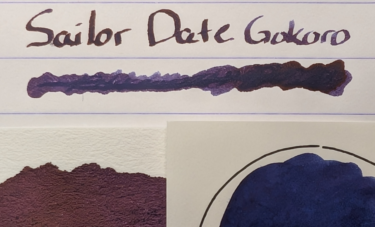
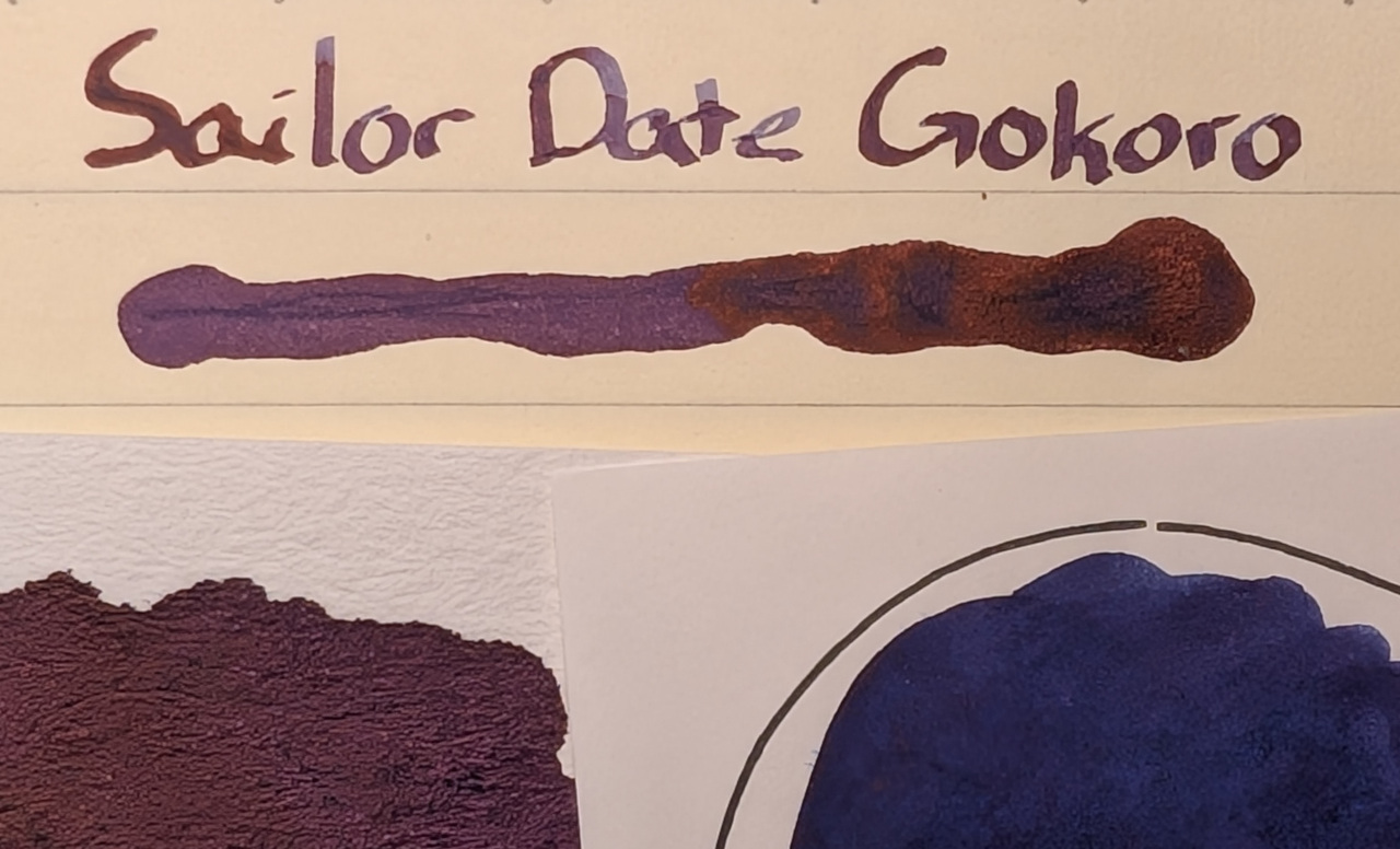
I tried it on different paper but none quite had the dramatic extremes of Col-o-ring vs Iroful. That at least tells me while neither one alone will necessarily demonstrate an ink’s true color, together they provide a useful bracketed frame of reference.
There were some nice variations between certain parts on different papers, especially MD/Life Noble which showed multi-shading well.
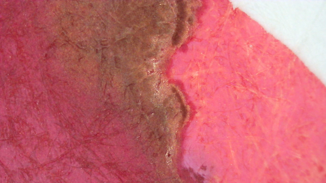
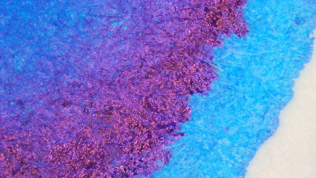
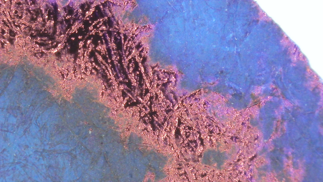
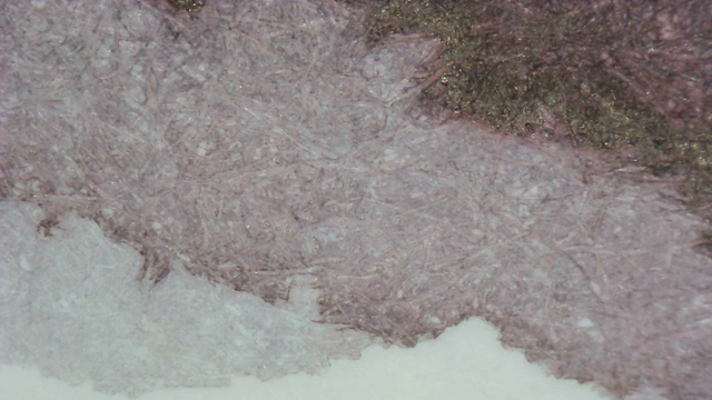
Microscope
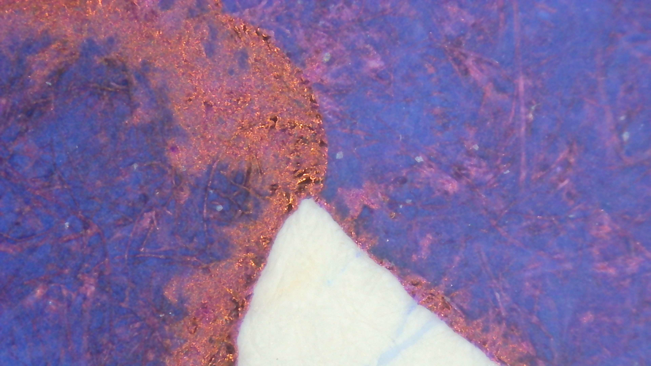
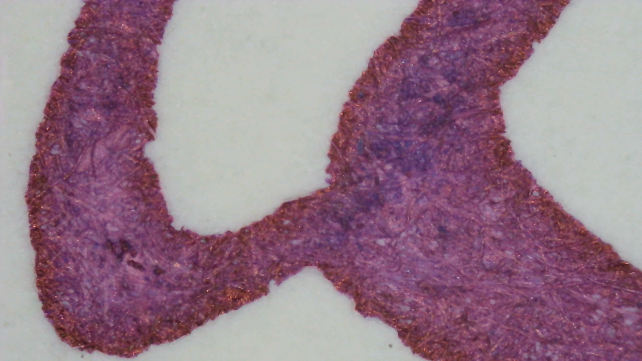
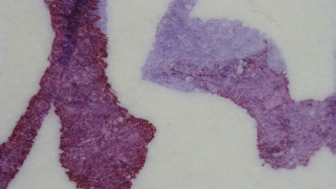
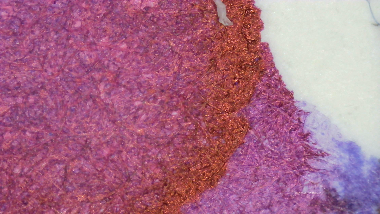
Chromatography

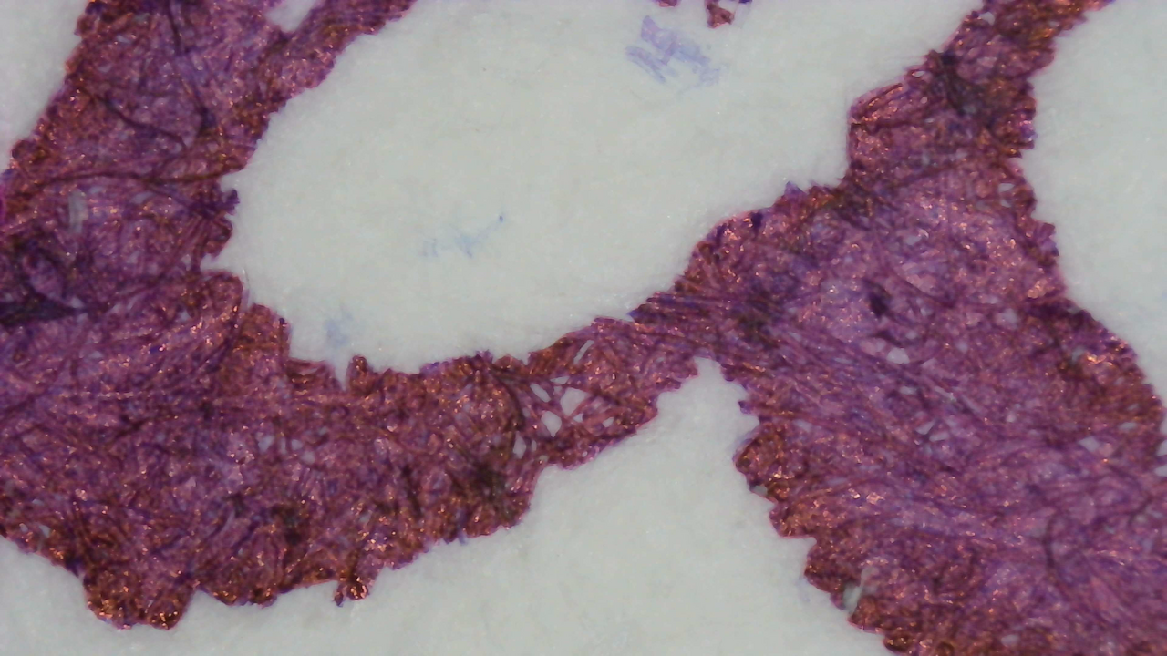
The Chromatography is mostly blue and then transitions to red, with some purple along the edges. As I’ve noted on other swatches, you can sort of draw a line down the middle of the chromatography strip and Iroful shows the lower portion more prominently in the background of the paper while the upper portion is in the paper fibers and edges of the lines.

Nothing too noteworthy under UV light, but there is a slight blue glow in the empty area near the leading edge and around the front.
Verdict
Color trickery aside, the ink is really good. I’ve used it in EF and stub nib pens and it’s done well in both. It is a tad on the dry side, but not too dry. In an EF Kakuno it makes a great ink to write on super absorbent paper such as my chromatography strips. It’s the ink I’ve used to label almost all of mine.
Questions or comments? Contact me on Mastodon