
KWZ Smells Like Coffee is a medium brown ink that, true to its name, smells like coffee.
I have to be careful with scents so I got a sample to find out if I could tolerate it.
Surprisingly, the scent has been good and not harsh or harmful to me. I’ve seen lots of complaints about scented inks misbehaving in various ways, so I was happy to find out this one worked well. It’s also not too watery, and seems to have some nice shading and a tiny bit of sheen.
The scent does fade after a while, but I haven’t measured exactly how long. A swatch I made about two and a half months ago still has a slight scent. Swatches from a year and a half ago have no scent.
I liked it well enough that I bought a bottle!
Scans
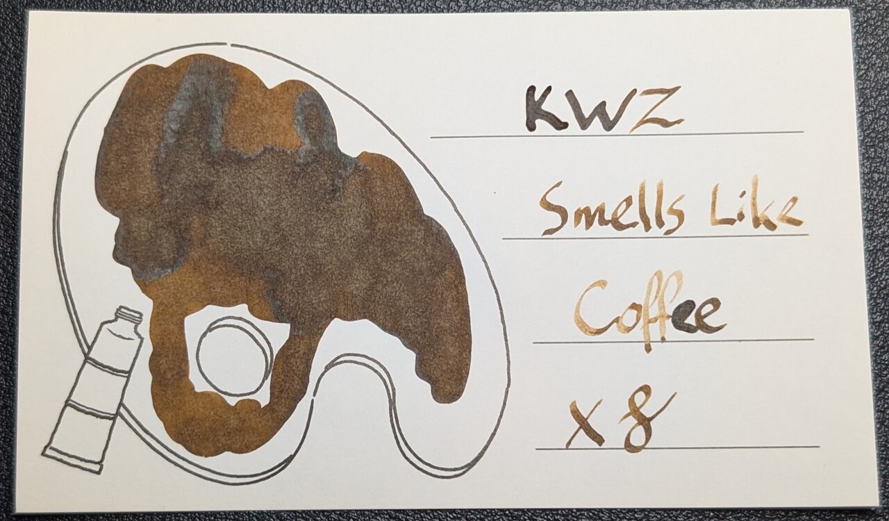
The scans are a touch darker than it appears to the eye, but not much.
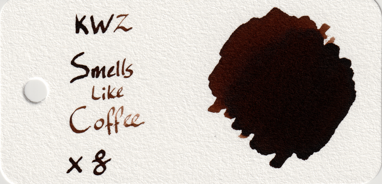
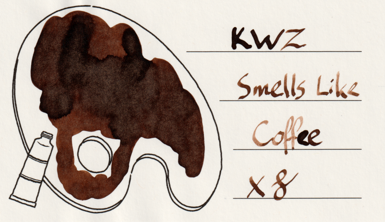
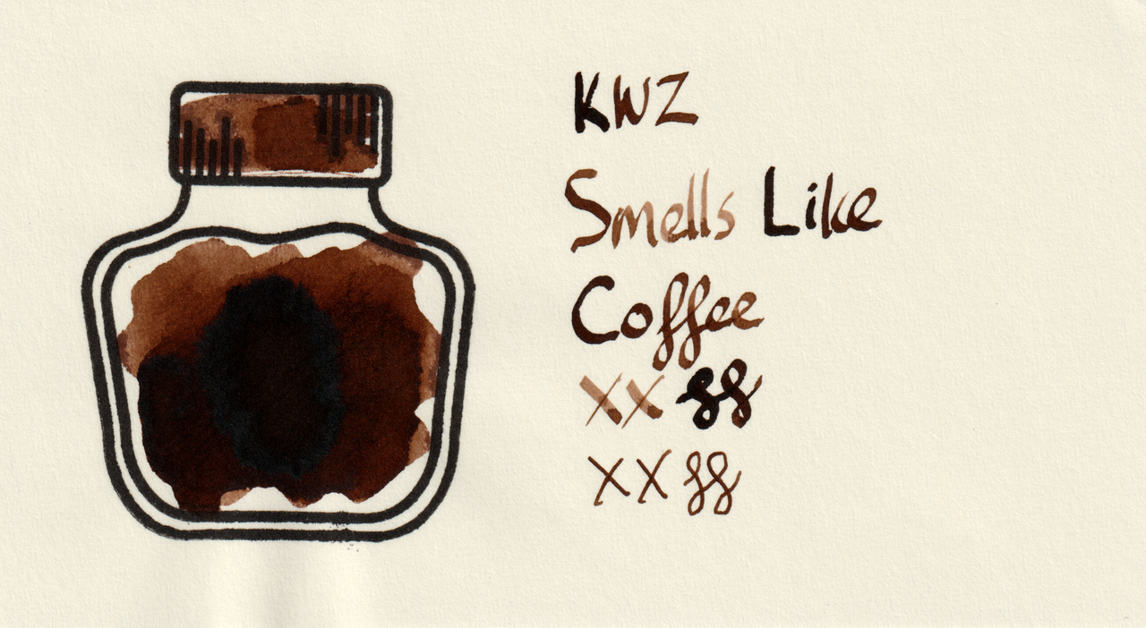
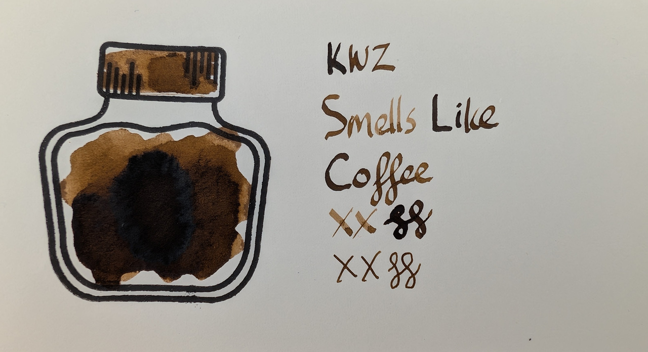
MD paper seems to hit a sweet spot of the best color for me. Col-o-ring is a bit too dark.
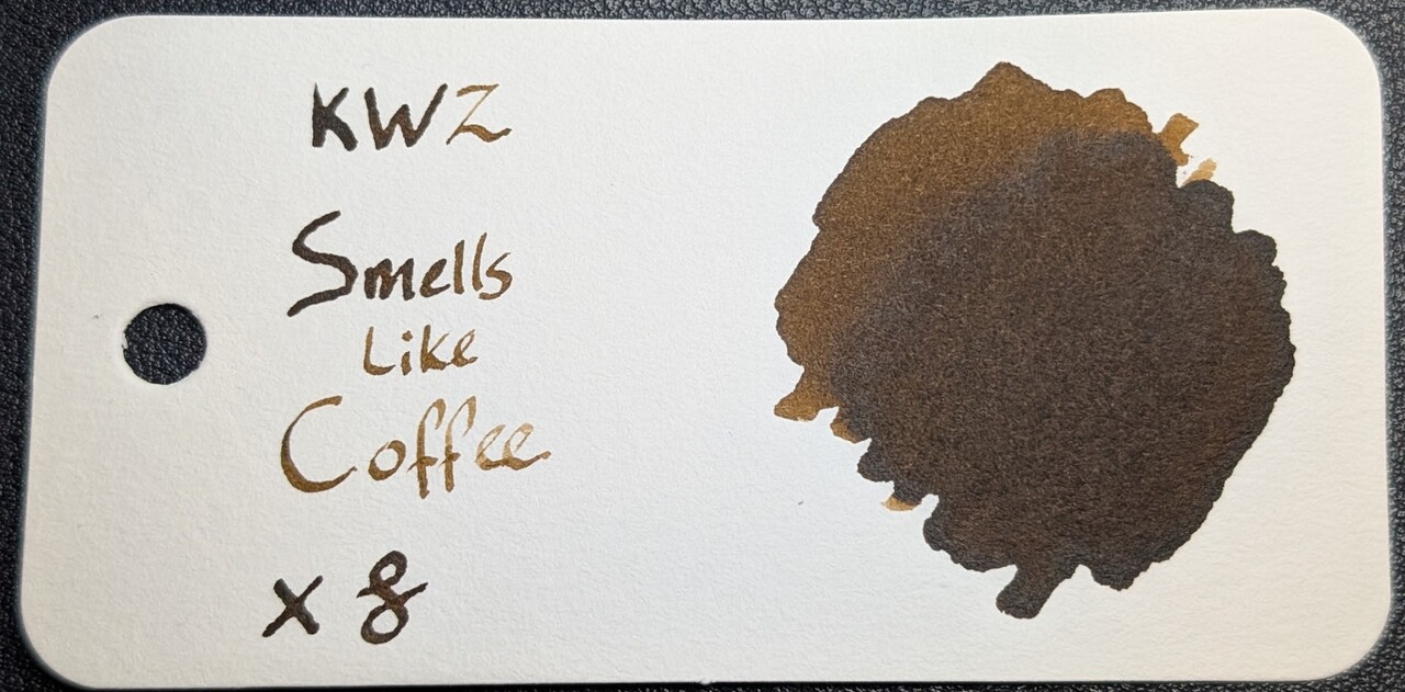
Photos
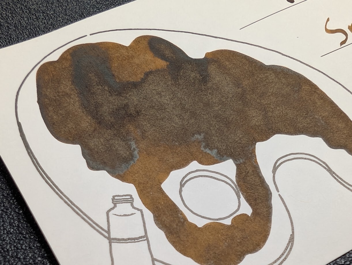
In the photos, you can see a bit of the sheen show through in the large swatch areas, though it does not show in the writing.
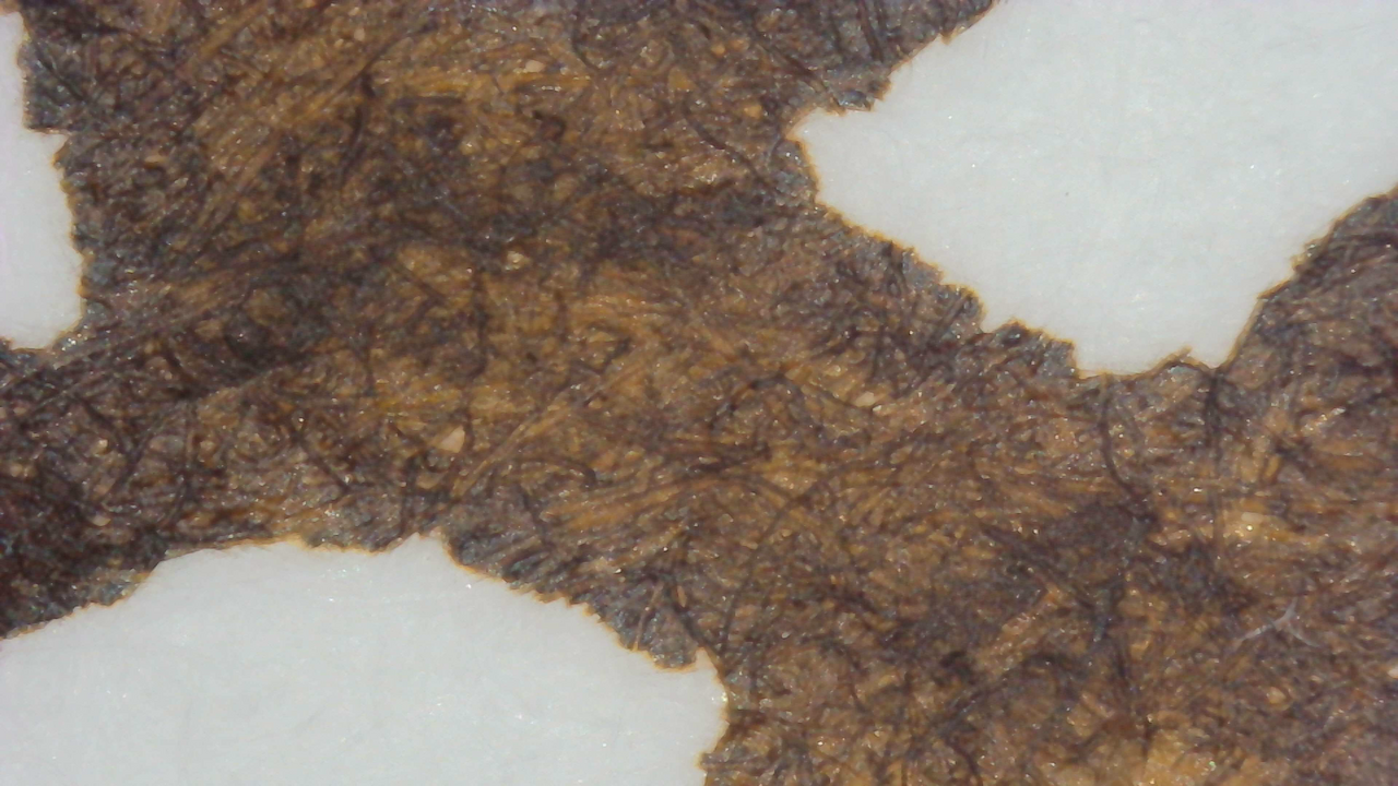
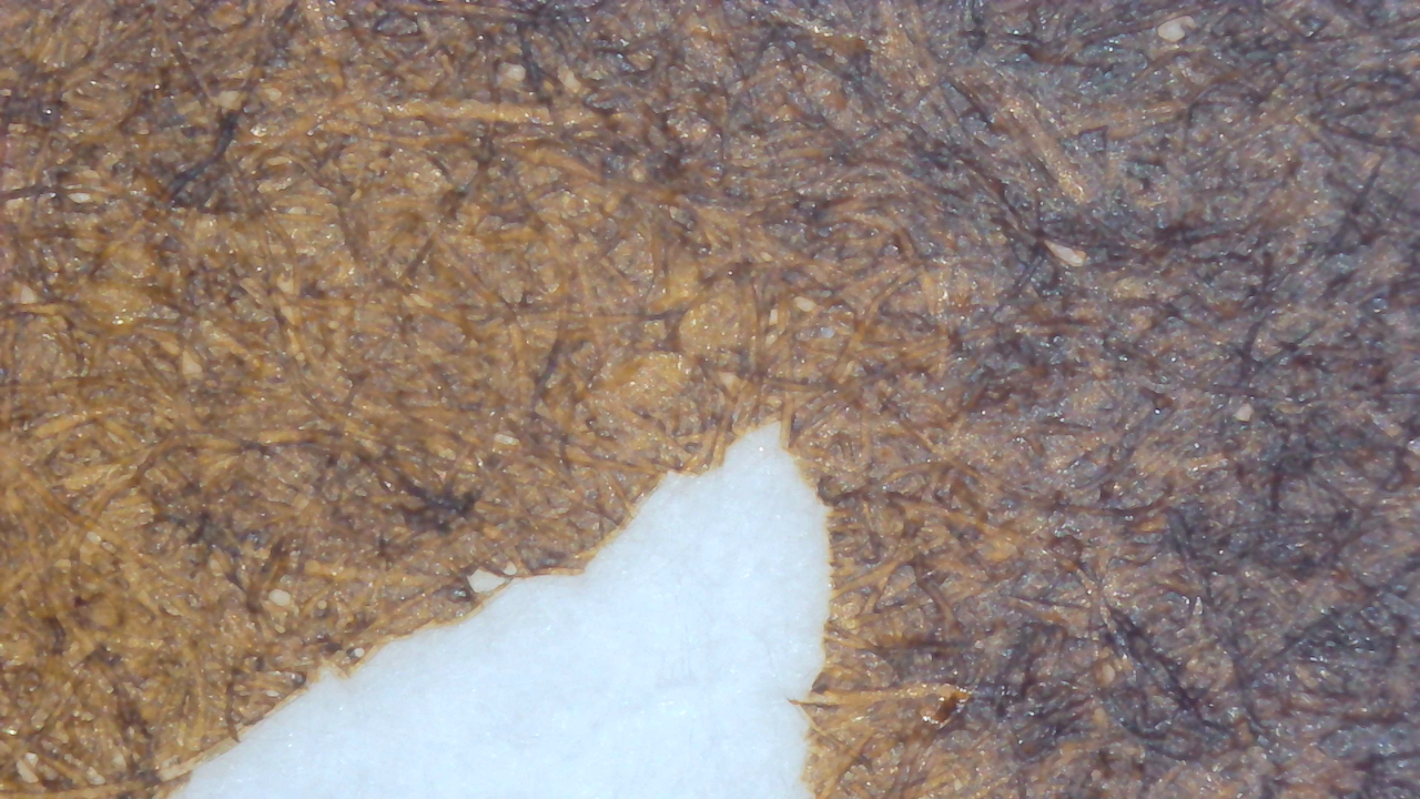
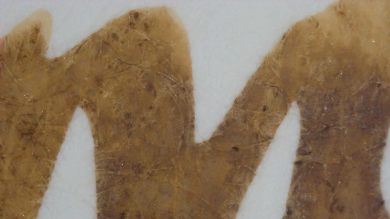
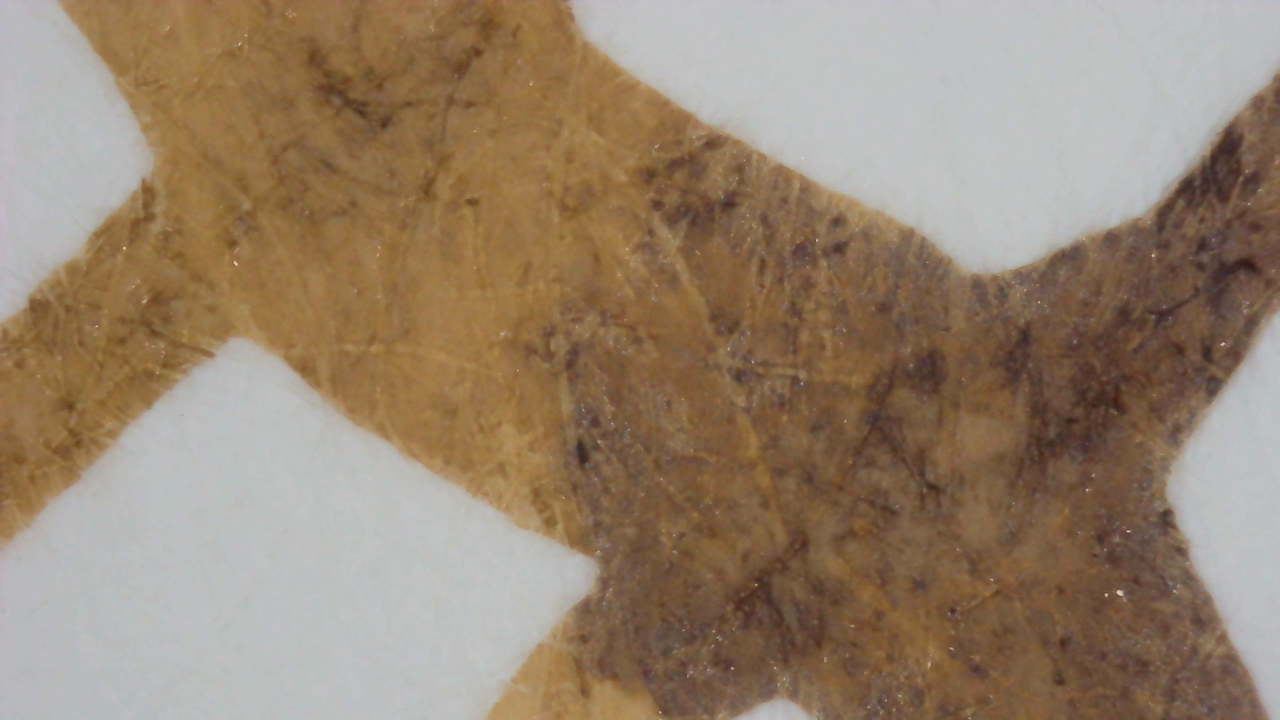
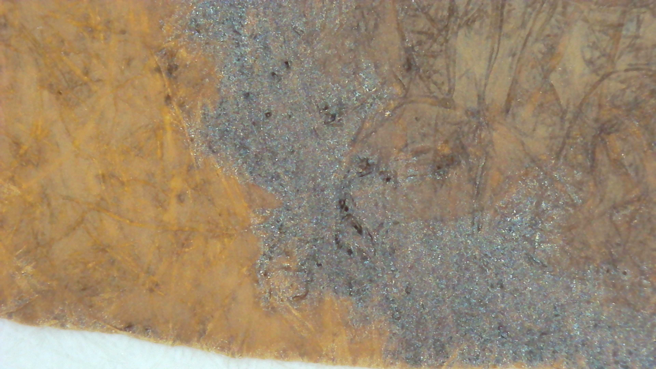
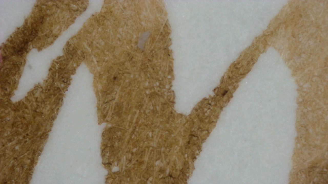
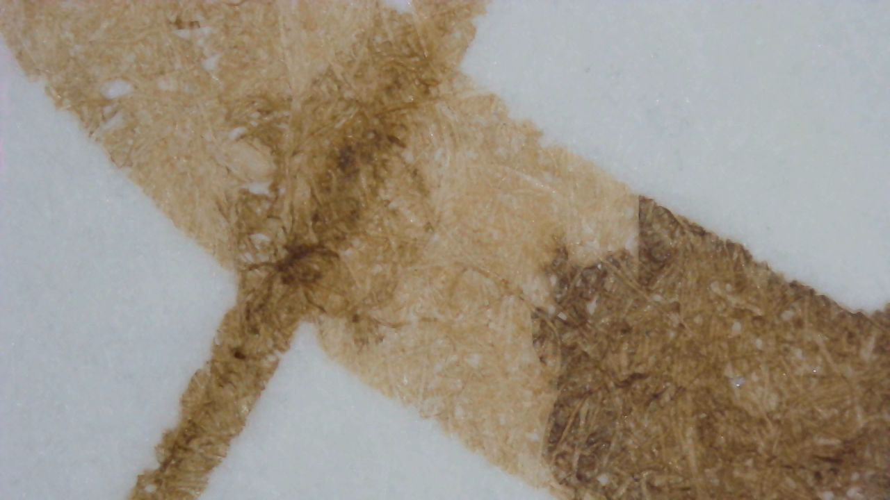
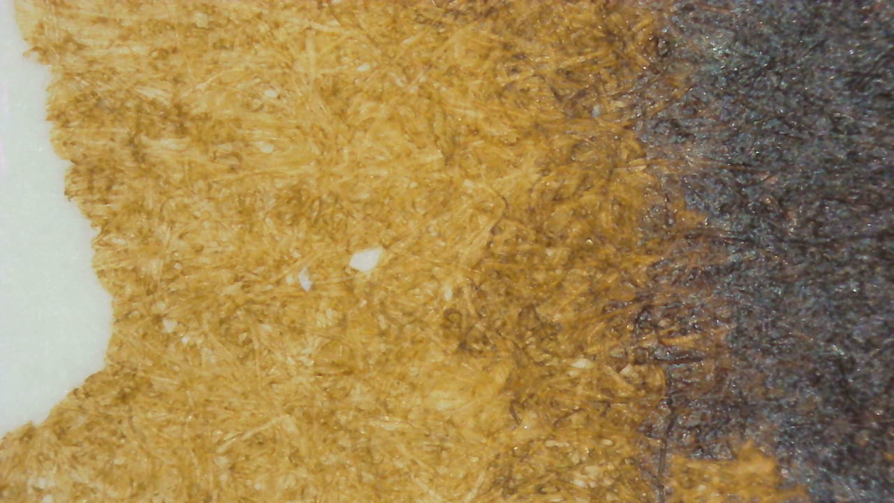
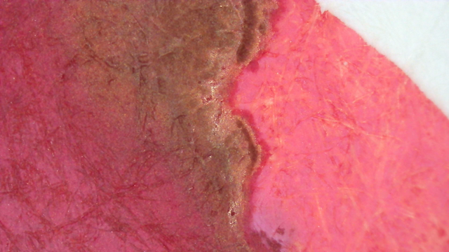
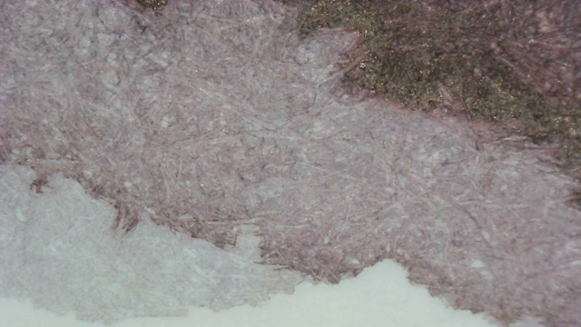
Microscope
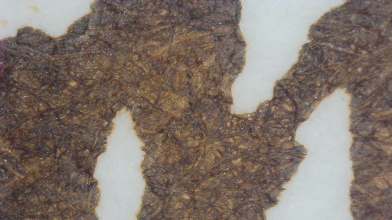
In the microscope photos, Iroful looks the best as usual. Smooth edges on the lines, even saturation, less harsh transitions on the shading, and a bit warmer than the others.
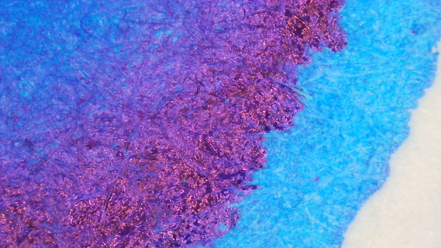
Chromatography

Chromatography seems to show it’s mostly slate blue and red-orange underneath. And it vaguely resembles a Bomb Pop popsicle!

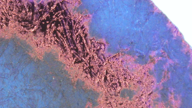
Nothing too noteworthy under UV light, but there is a slight blue halo past the leading edge.
Clean-up Note
You know how red inks sometimes look like blood when you clean them up? Yeah, this ink has its own class of problems there. I suspect most brown inks would suffer similar fates.
I almost attached a photo but then realized it looked a little bit too much like poo on TP rather than ink wiped off a nib.
Verdict
I like it even more than I expected, and the scent adds to it without introducing any problems. So far it hasn’t given me any trouble either with my head or in a pen.
Questions or comments? Contact me on Mastodon