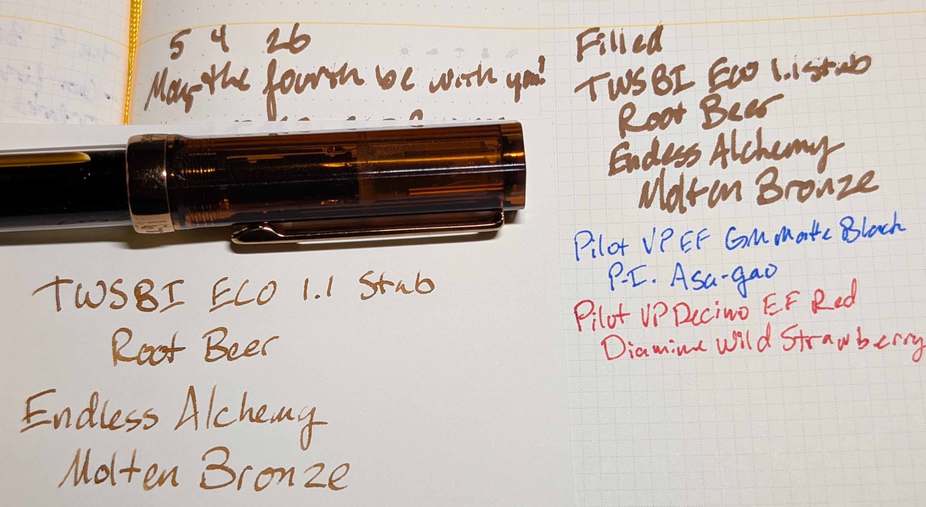
The launch deal Kickstarter tier for the Endless Phantom came with a free 45ml bottle of ink, so I opted for Molten Bronze since I don’t have any browns.

It’s pretty nice, some shading and though it doesn’t really sheen there is some green that comes through if enough ink goes down. Very “earthy”.

In an EF nib it’s mostly just a nice medium brown.

Scans

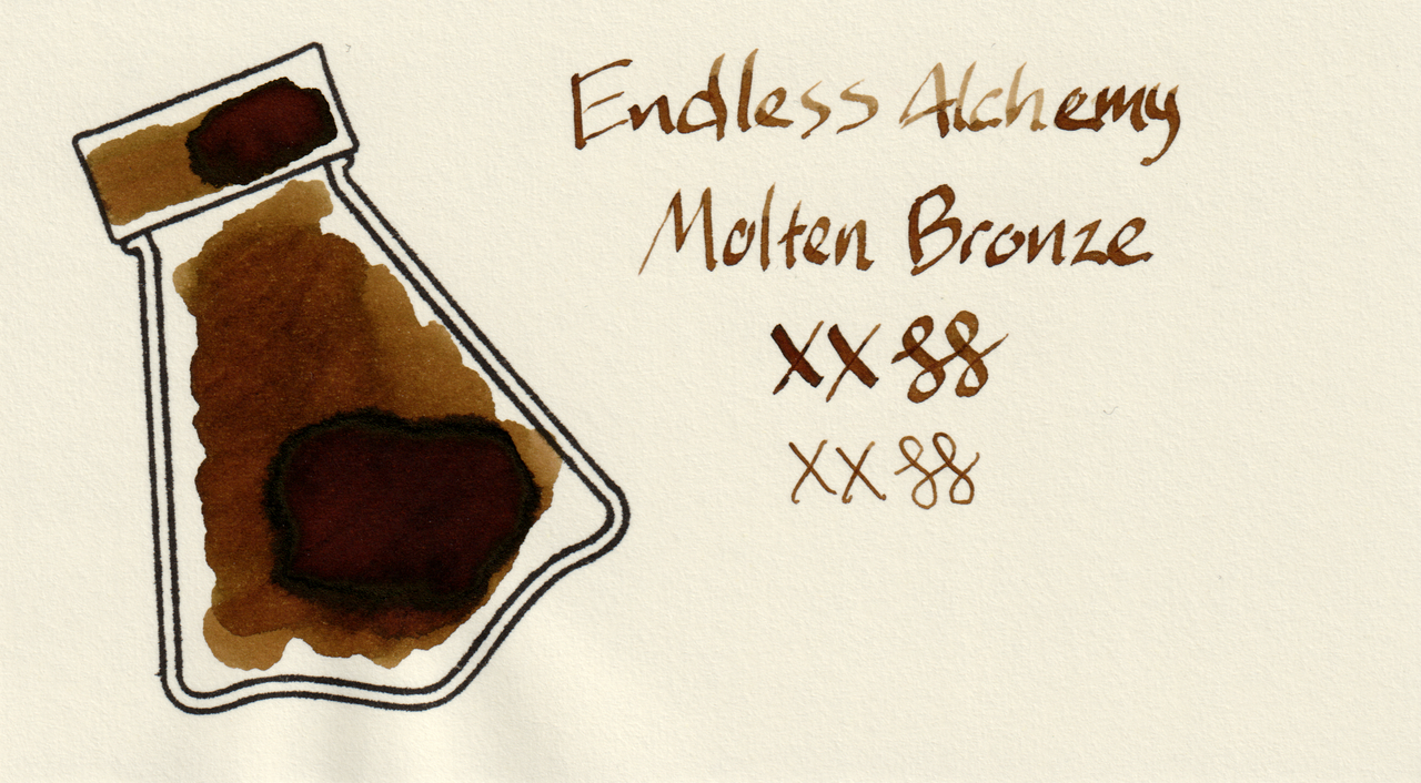
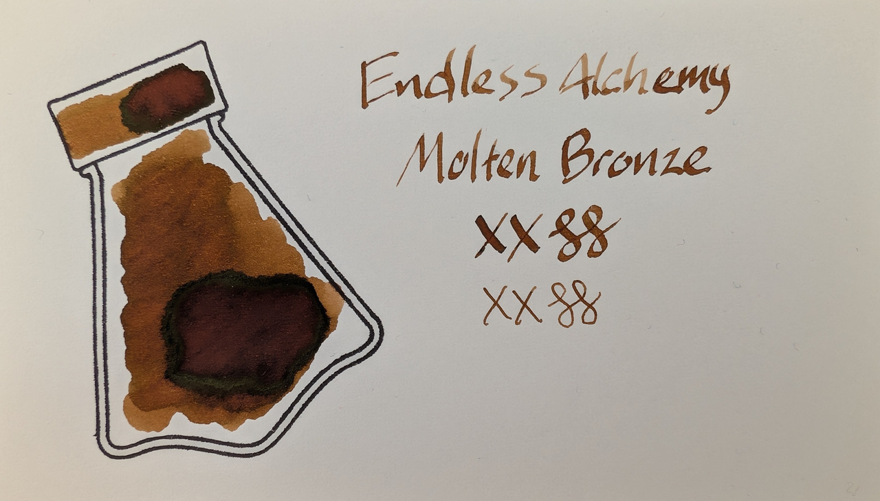
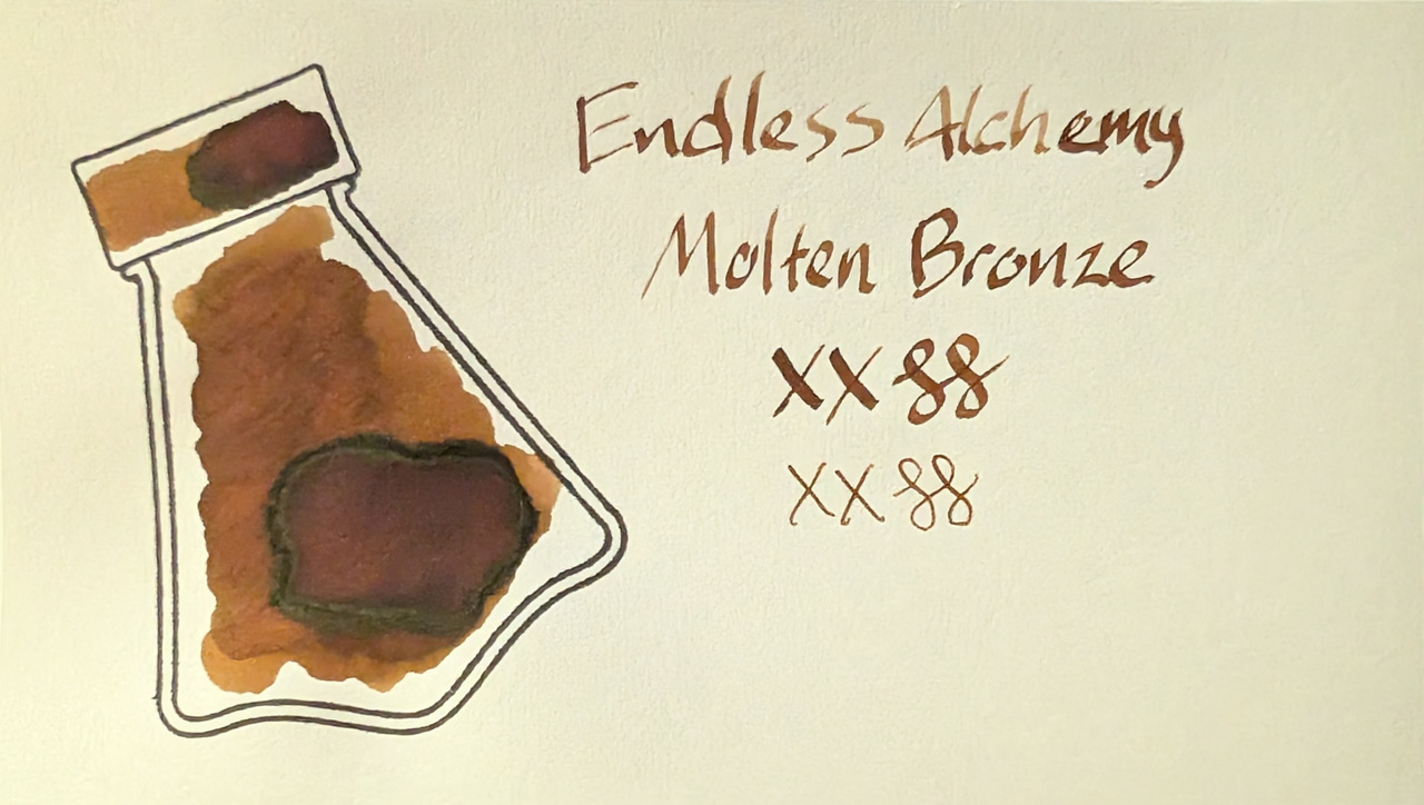
The color of the scans is very true to visible light on this one, compare with the photo of the MD card in the next section, it’s practically identical.
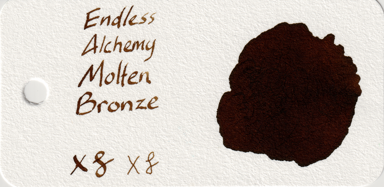
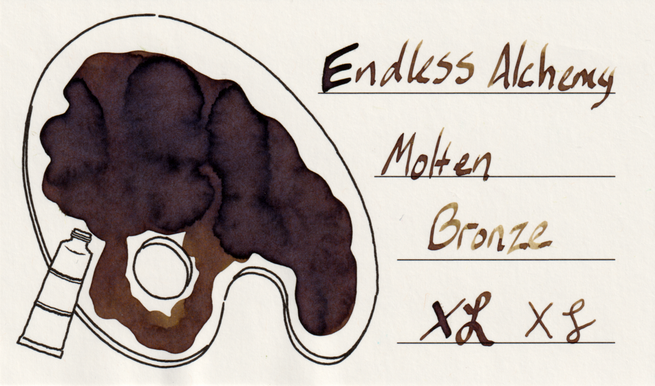
Scan of an ink swatch card made from Col-o-ring paper Scan of an ink swatch card made from Iroful paper Scan of an ink swatch card made from MD paper
Swatch Card Scans. Click to enlarge.

Check out the shading on the Iroful and MD card writing. It’s got good variation without being too light or too dark.

Photos
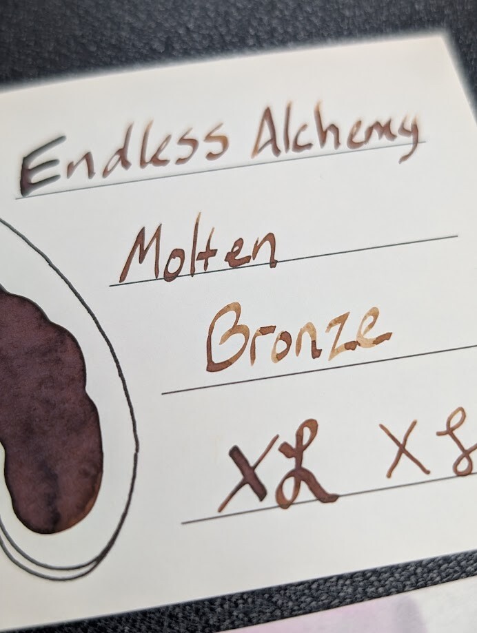
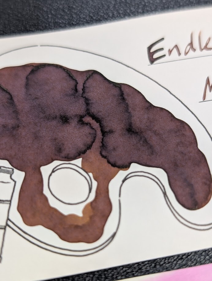
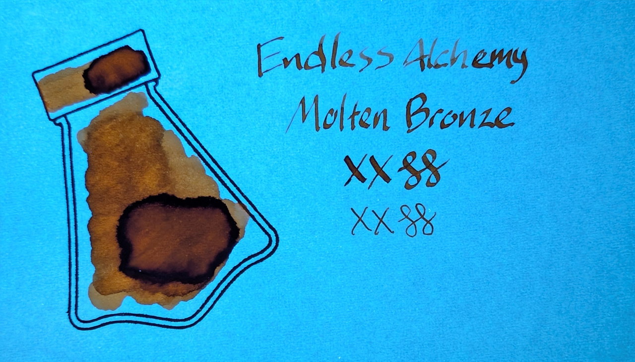
Low angle photo of an ink swatch card with text reading "Endless Alchemy Molten Bronze" followed by an X and curlicue in a stub and EF nib width.  Overall the ink is a medium brown with some shading to a darker hue in parts of the text where more ink settled. Low angle photo an ink swatch card.  Overall the ink is a medium brown with some shading to a darker hue.  The card is an Iroful swatch card with an outline of a paint palette. Inside the palette is mostly filled in with swirls of brown ink. Areas with less ink are lighter brown, areas with more ink have a little gray tone to them.
Swatch Card Photos. Click to enlarge.

Microscope

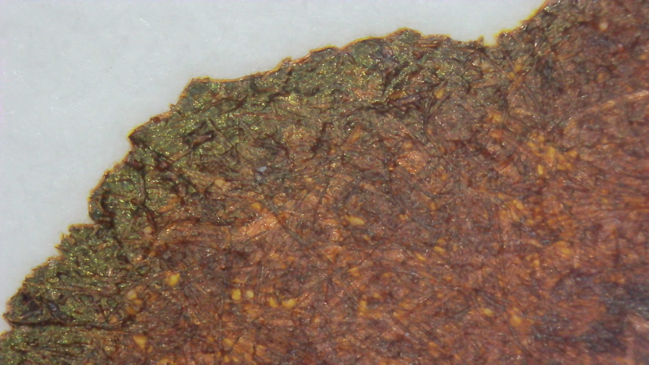
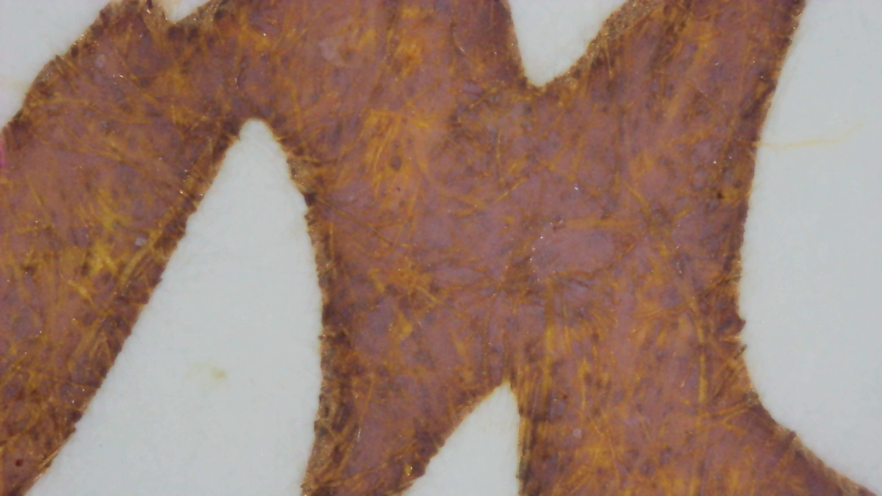
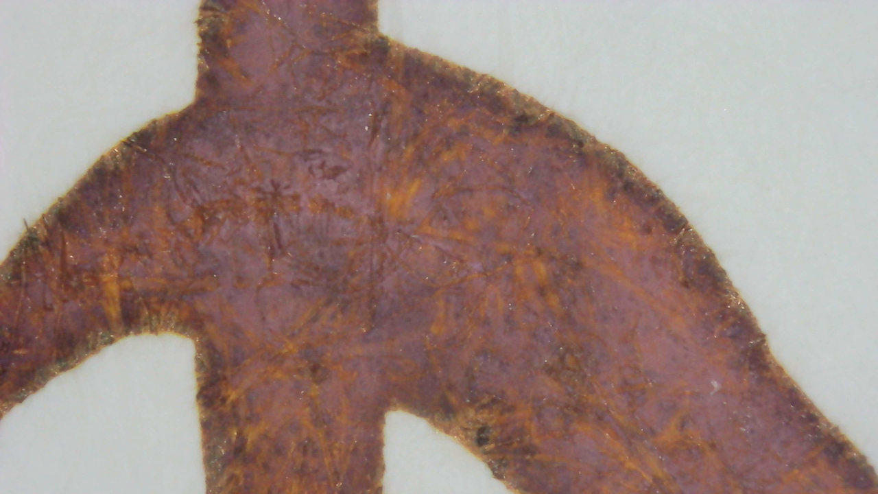
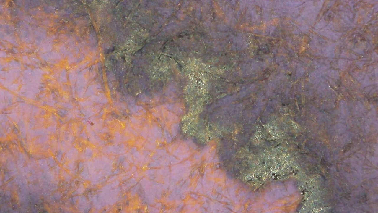
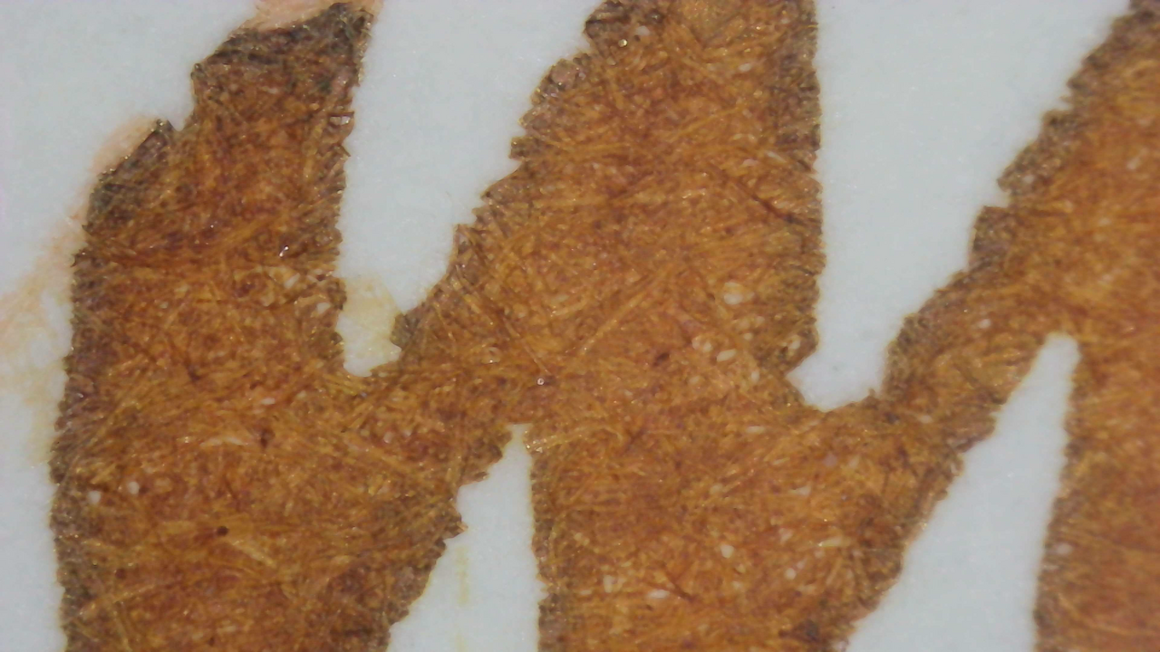
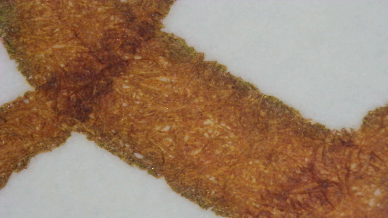
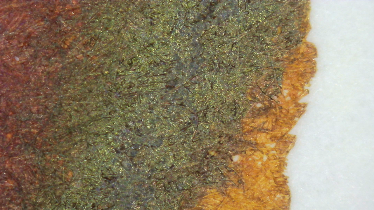
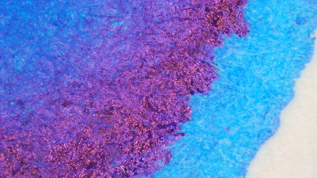
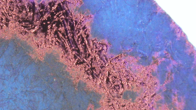
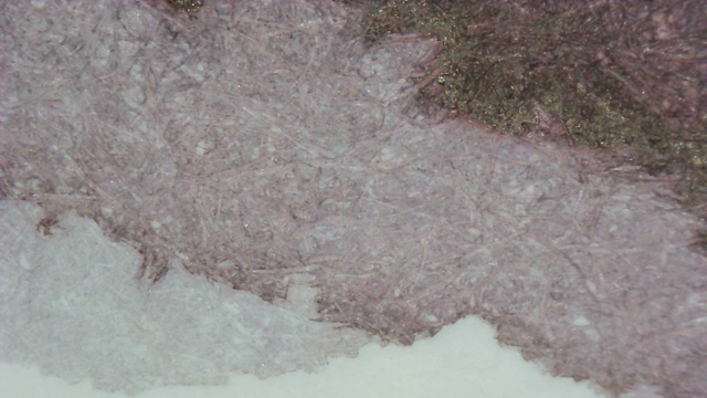
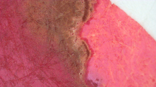
In the microscope photos you can see the sheen around the edges in writing and in thicker lines on the larger swatch areas.
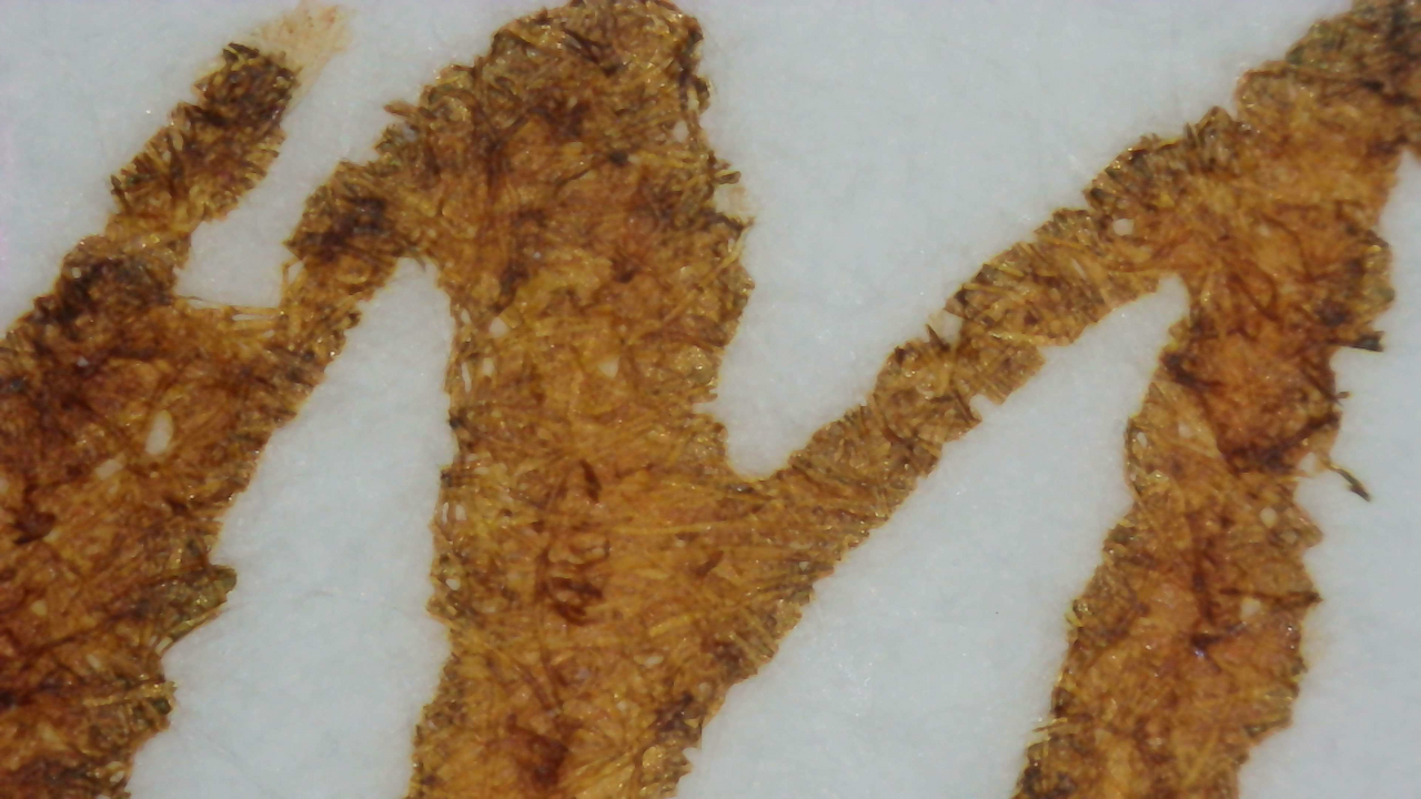
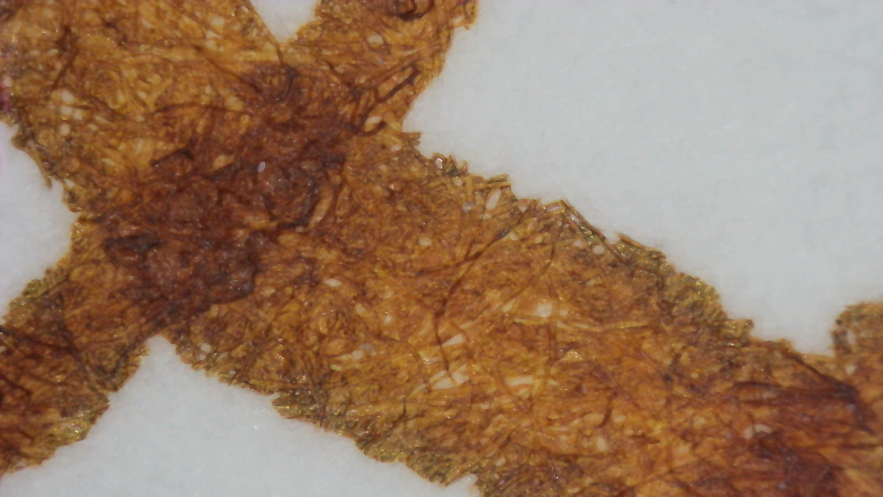
Microscope photo of ink on the Iroful swatch card.  On the left it is light brown overall, but looking closer it is almost blue-gray tone with coppery color ink the paper fibers.  On the right it is much darker brown with some hints of blue-gray gray between the fibers.  The area where the two sides meet is a dark but shiny metallic green.
Ink under Magnification. Click to enlarge.

Chromatography

Chromatography has a lot going on! Gray, pink, yellow, green, and blue. A little bit of everything.

If you compare the chromatography to the Iroful microscope photos you can see the fibers in the foreground mostly have the colors on the left while the background has the colors on the right. The way the ink absorbs at different levels may partially explain why Iroful has a way of drawing out such unique behavior.

Photo of chromatography paper under UV light.
Chromatography strip photo under UV light

The magenta section glows brightly, and a small area of yellow glow, plus a bit of a dull orange glow past that.

UV Check
Swatch Card Photos under visible and UV light. Click to enlarge.

It does glow somewhat in UV, but not as much as I’d hoped based on the glow in the chromatography. Instead it only looks like itself, but brighter. It’s a neat effect, but not a standout.

Group Photo

Nothing surprising in this group photo, but the large swatch area on Col-o-ring is a bit lighter here.
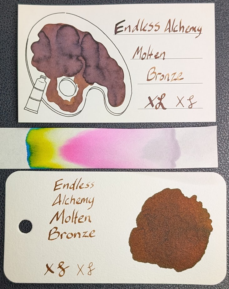
Photo of two ink swatch cards and a chromatography strip. Both cards have text reading "Endless Alchemy Molten Bronze" followed by an X and curlicue in a stub and EF nib width.  Overall the ink is a medium brown with some shading to a darker hue.  The top card is an Iroful swatch card with an outline of a paint palette. Inside the palette is mostly filled in with swirls of brown ink. Areas with less ink are lighter brown, areas with more ink have a little gray tone to them.  The bottom is a Col-O-Ring swatch card. It has a large vaguely circular blob of even dark brown ink.  The chromatography strip starts sort of a light gray with a slight red tint, then changes to very bright magenta, then a little clear, then yellow, and finally cyan.
Group photo of Iroful, Col-o-ring, and chromatography strip

Verdict

All good to me! I’ve used it in a couple different pens and it’s done well.
Based on a Mastodon Post

Updated:


Questions or comments? Contact me on Mastodon