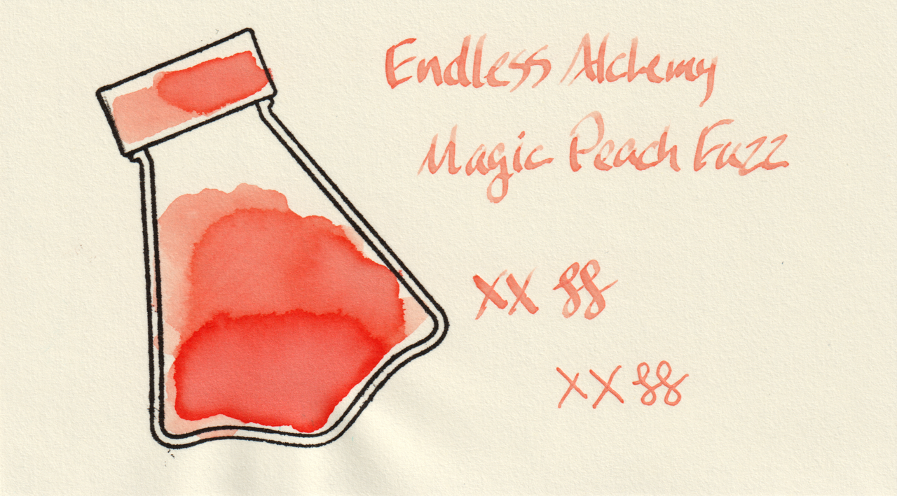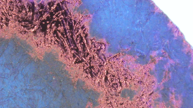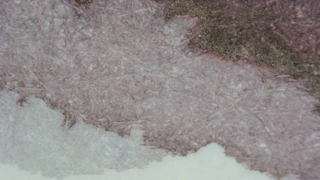
This sample of Endless Alchemy Magic Peach Fuzz was free from JetPens. It’s a very pale peach/salmy with some shimmer.

Scans

The scans appear darker and more salmon-ish than it does in visible light, likely the scanner software attempting to correct for the ink being so pale.

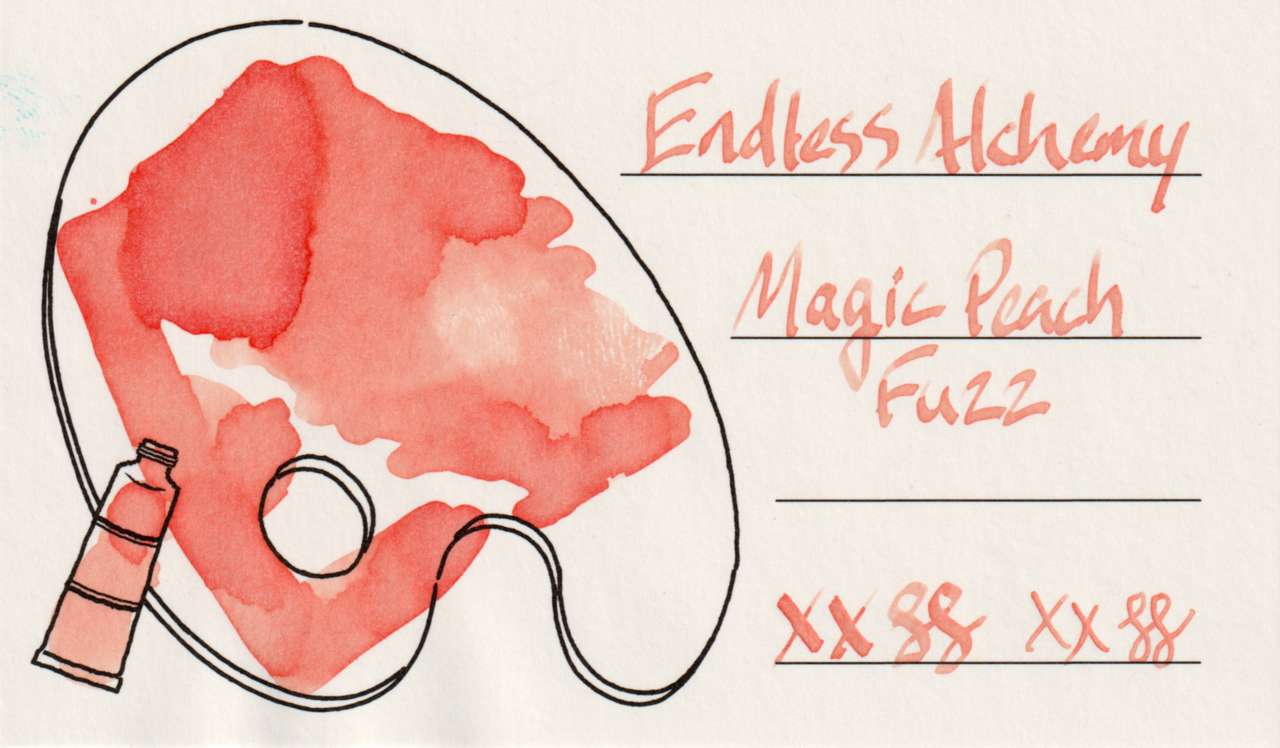
Scan of an ink swatch card made from Col-o-ring paper Scan of an ink swatch card made from Iroful paper Scan of an ink swatch card made from MD paper
Swatch Card Scans. Click to enlarge.

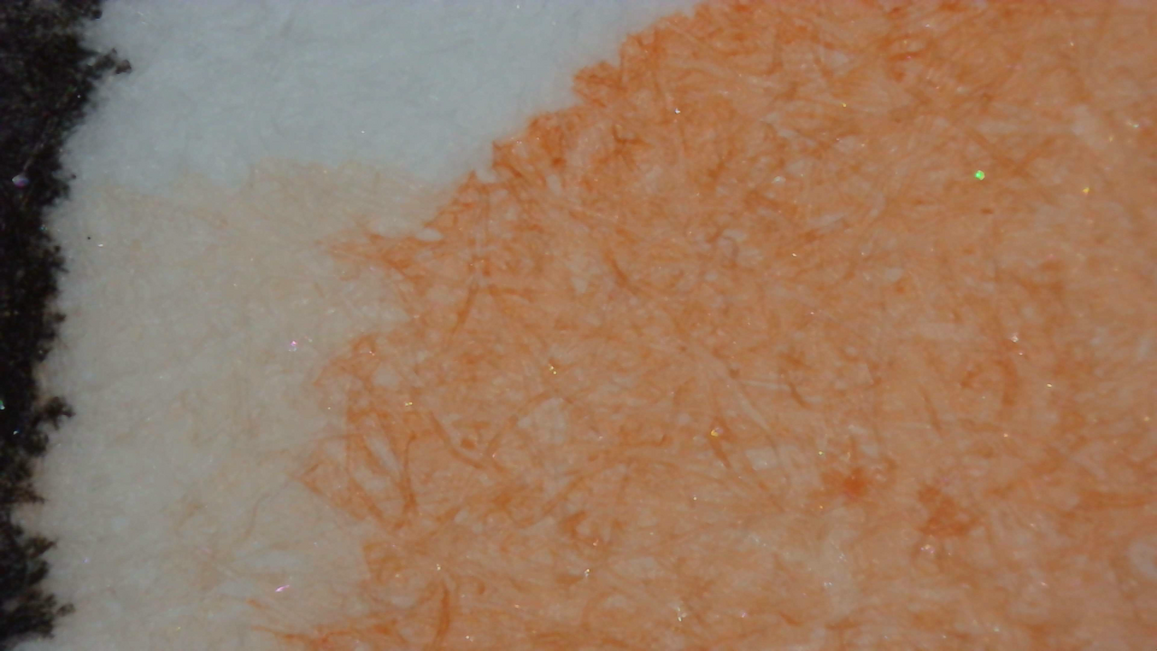
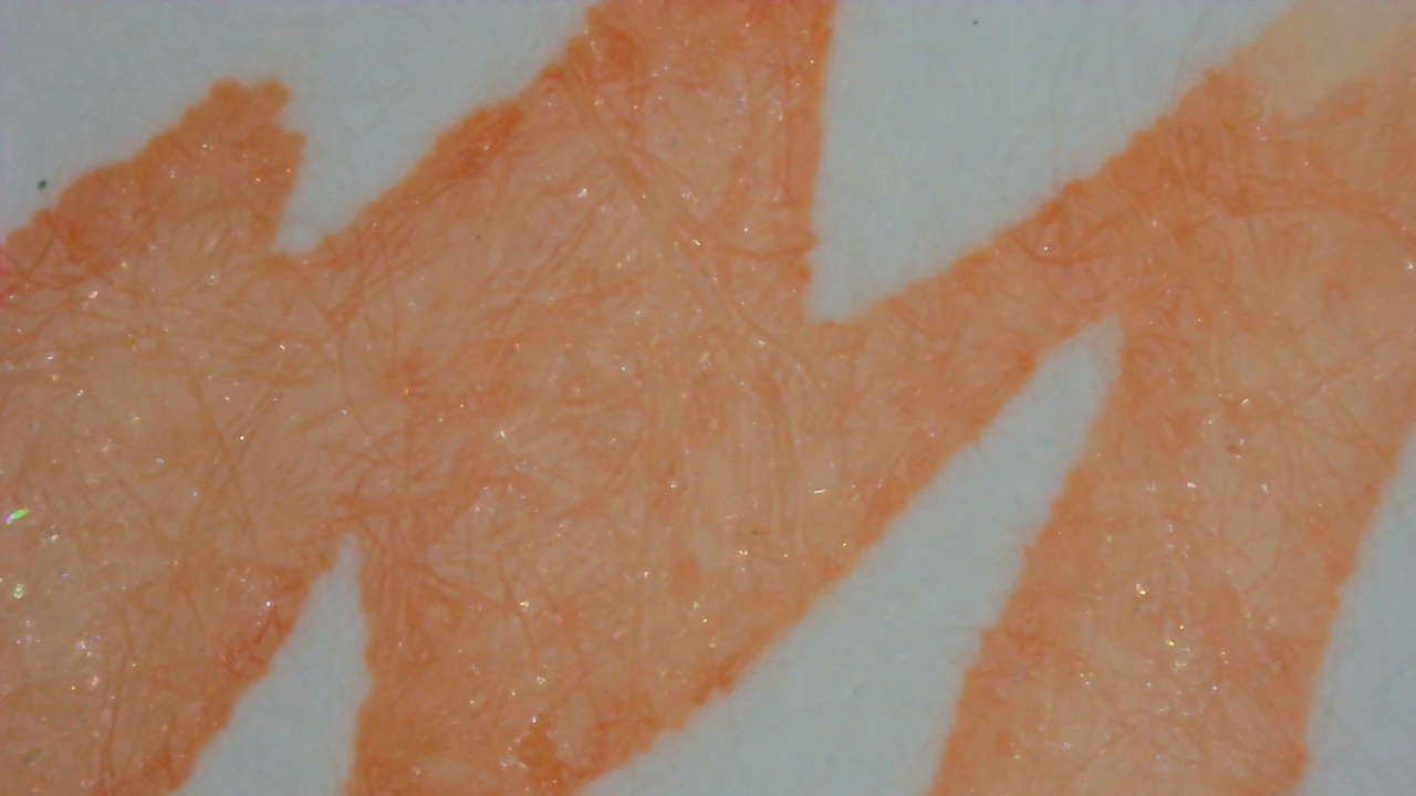
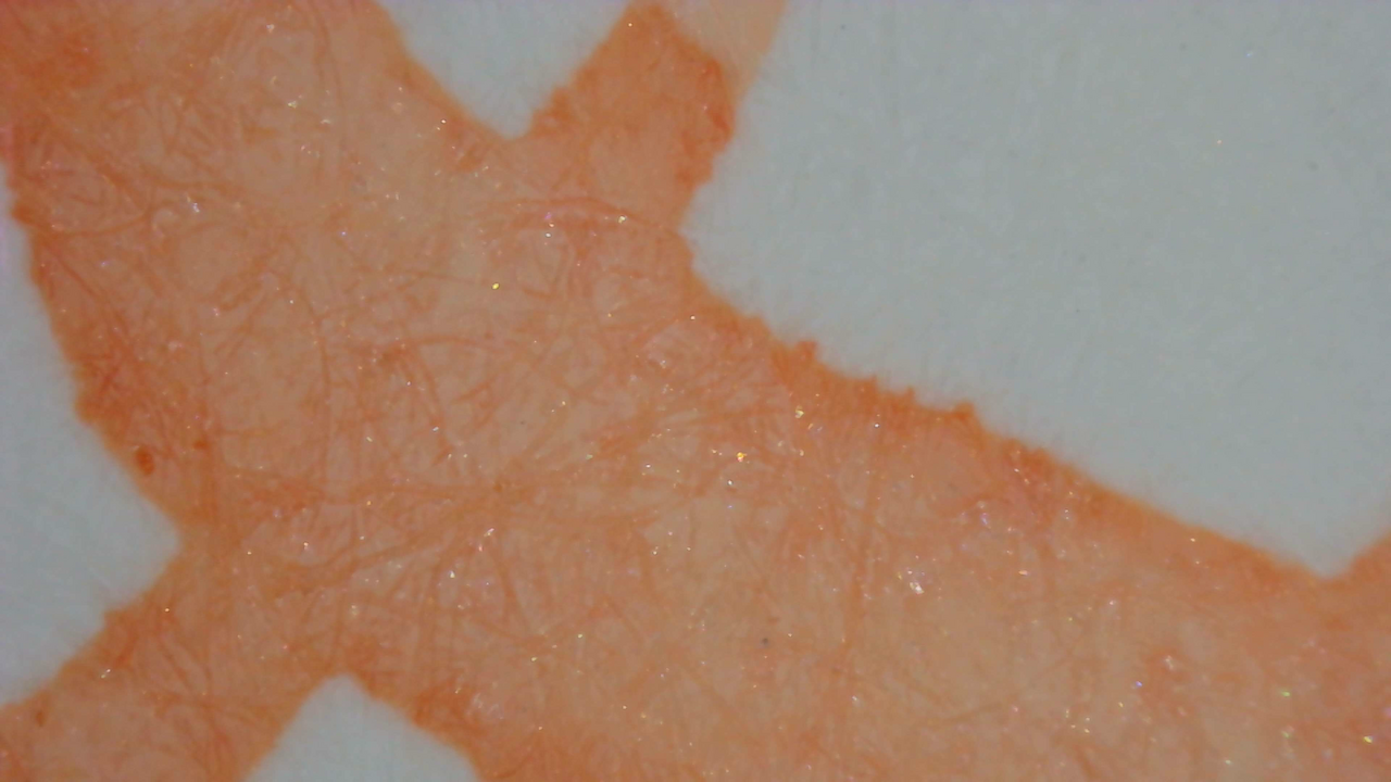
Microscope

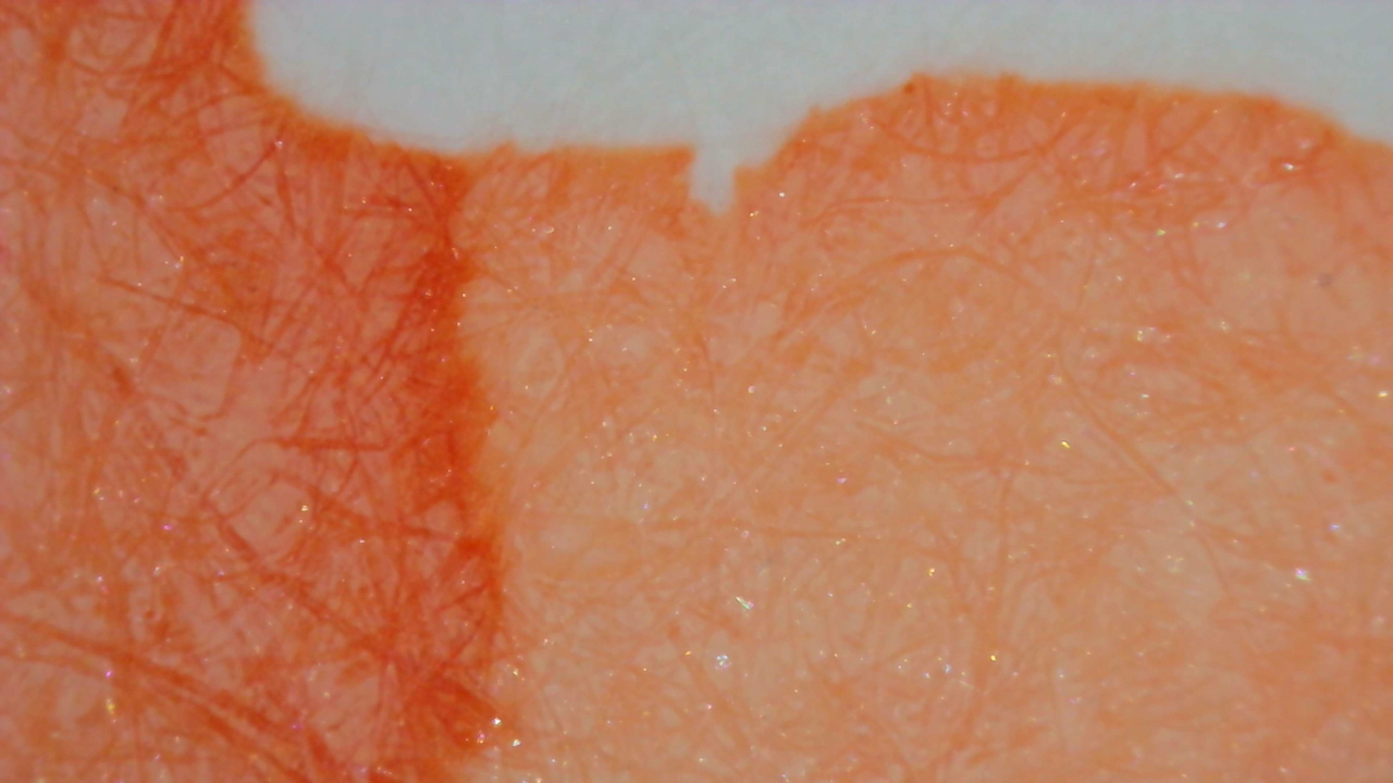
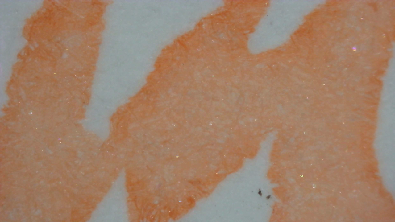
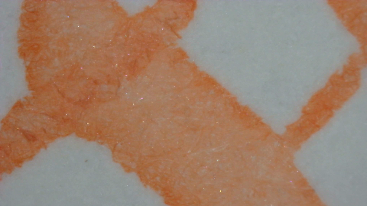
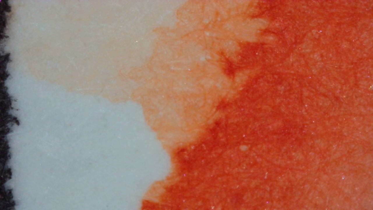
Still not a fan of this one, but it makes another good example of the paper types and smoothness of the letters, shading, and such. Even when I forget to label or sort the photos between paper types it’s not difficult to tell them apart from how the lines look.
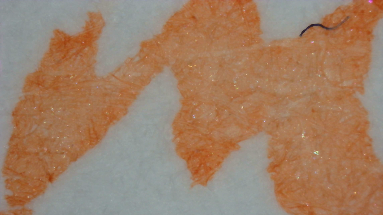
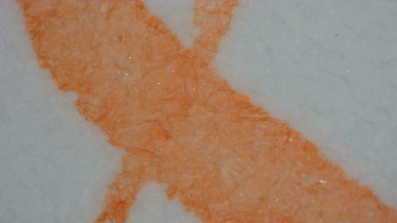
Ink under Magnification. Click to enlarge.

Iroful is extremely smooth, Midori is sorta smooth, and Col-o-ring is rough.

Chromatography

Like the ink, the chromatography is very pale, some very pale pink and yellow.

Photo of chromatography paper under UV light.
Chromatography strip photo under UV light

Nothing too noteworthy under UV light, but there is a slight green halo past the leading edge.

Group Photo

The group photo gives a better impression of how pale and “peach-y” it is in visible light. And how the chromatography is barely visible.
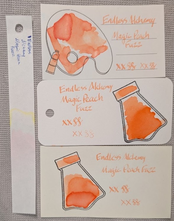
Photo of 3 ink swatches & chromatography strip for Endless Alchemy Magic Peach Fuzz which is a very pale peach colored ink with a little shimmer and some shading.  Each swatch contains the ink name followed by "XX" 2 curlicues in both stub and EF widths.  Swatch 1: Iroful swatch card with an outline of a paint palette and tube. The palette is mostly filled in with swirls of ink, a few areas are darker with some visible shimmer, and darker edges. There is an outline of a paint tube which is swabbed and looks similar. The writing is very pale and some areas with less ink are even more pale, barely visible.  Swatch 2: Col-o-ring swatch card with a stamped outline of an Endless Alchemy ink bottle, which is flask-shaped and tilted. The outlined area is mostly full of an ink blob which is darker at the bottom and paler at the top in a gradient. Shimmer is visible only in the darkest area. Swab across "cap" is similar. The stub writing sample is slightly darker than on Iroful, but the EF is more pale.  Swatch 3: Midori MD swatch card with a stamped outline of an Endless Alchemy ink bottle. The outlined area is mostly full of an ink blob which is darker at the bottom and paler at the top but in three distinct areas. Shimmer is visible only in the darkest area. Swab across "cap" is similar. Text is even more pale with pronounced shading.  Chromatography is barely visible, pink first then some yellow.

Verdict

I’m glad I tried the sample because I didn’t care for it. Far too pale and not a color I like, subtle shimmer is nice though.
Based on a Mastodon Post

Updated:


Questions or comments? Contact me on Mastodon