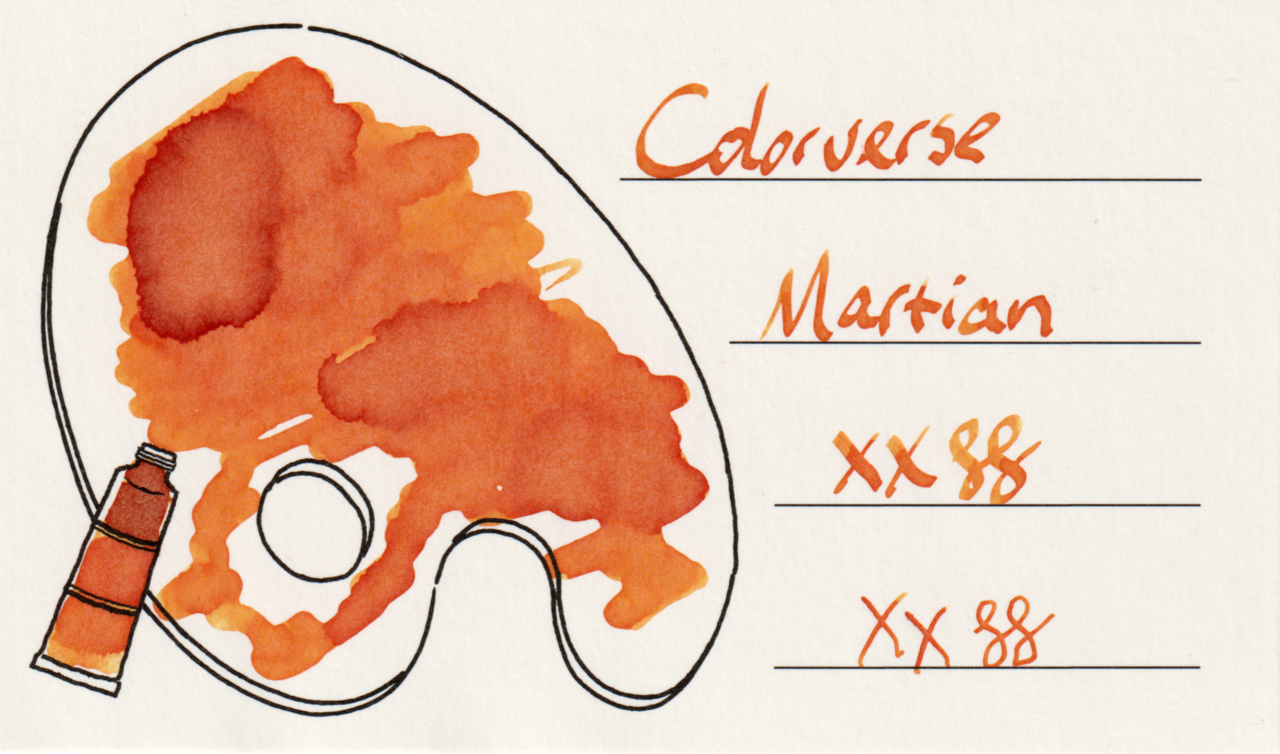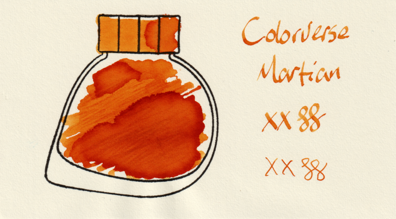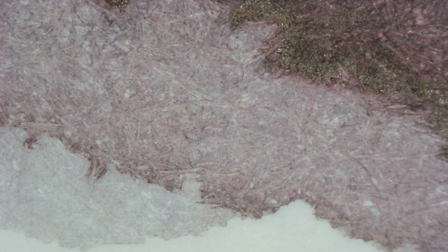
Colorverse Martian is a bright red-orange.

This is the first of a trio of Colorverse ink samples I was gifted last year in the Secret Santa exchange.

The teeny tiny 5ml Colorverse glass sample bottles are fun, but not very useful. I had to pipette ink out into an inkwell just to swatch them because no dip pen I had would fit in the bottle opening.

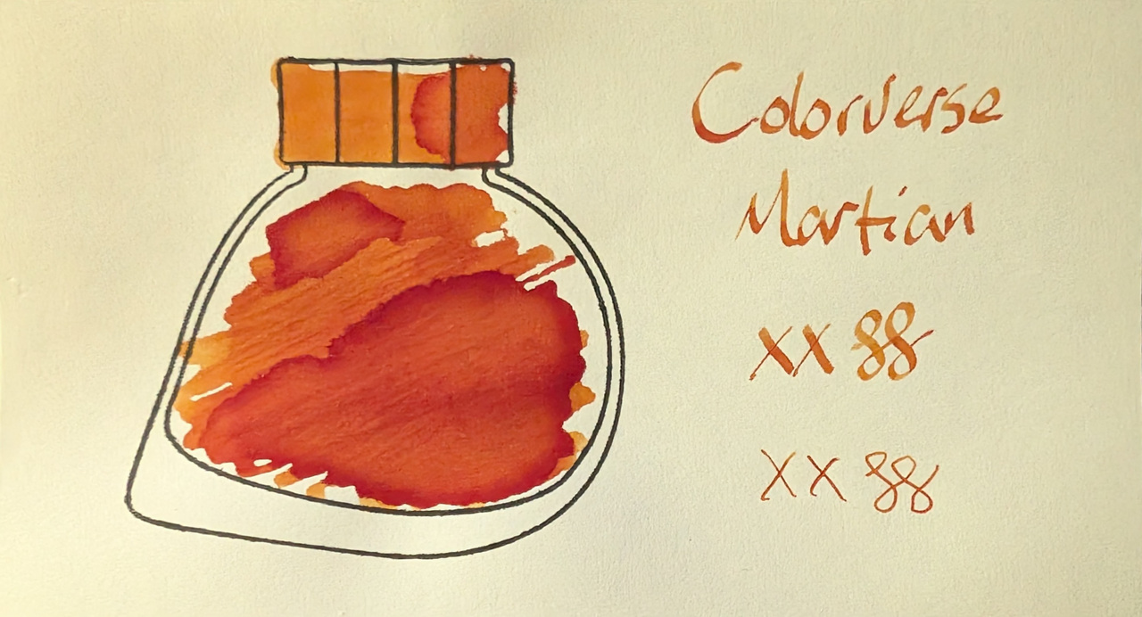
Scans
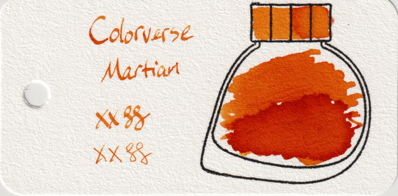
Scan of an ink swatch card made from Col-o-ring paper Scan of an ink swatch card made from Iroful paper Scan of an ink swatch card made from MD paper
Swatch Card Scans. Click to enlarge.

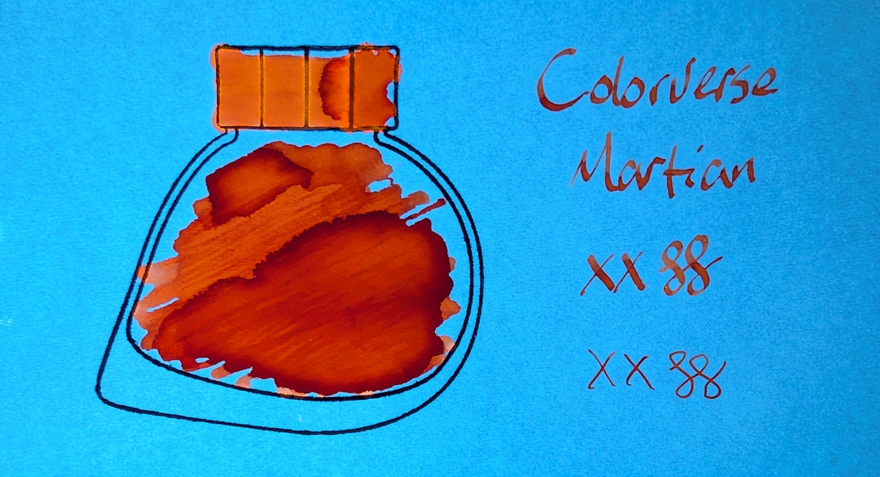
There is prominent shading on all papers, and no sheen. The color is fairly uniform in writing across all three papers, though the large swatch area on Iroful is a bit more pale/shaded.

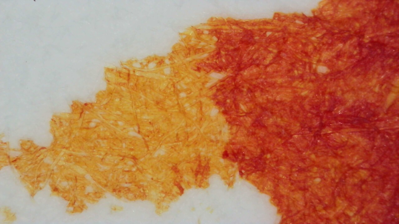
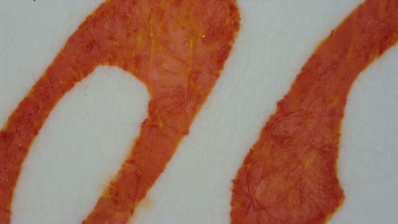
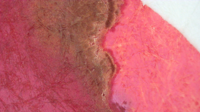
Microscope

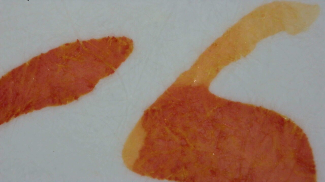
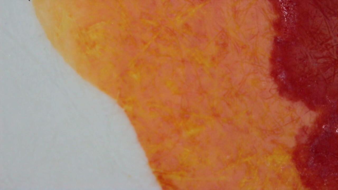
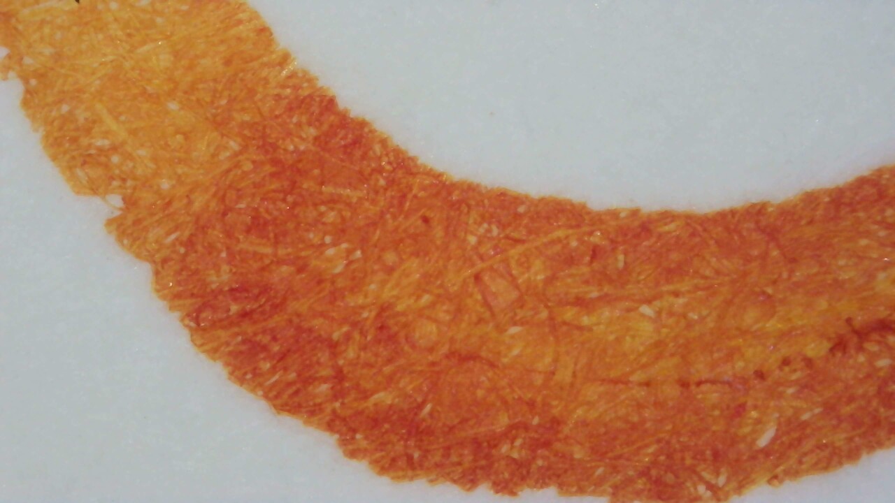
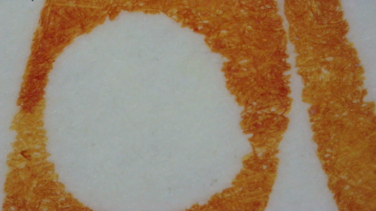
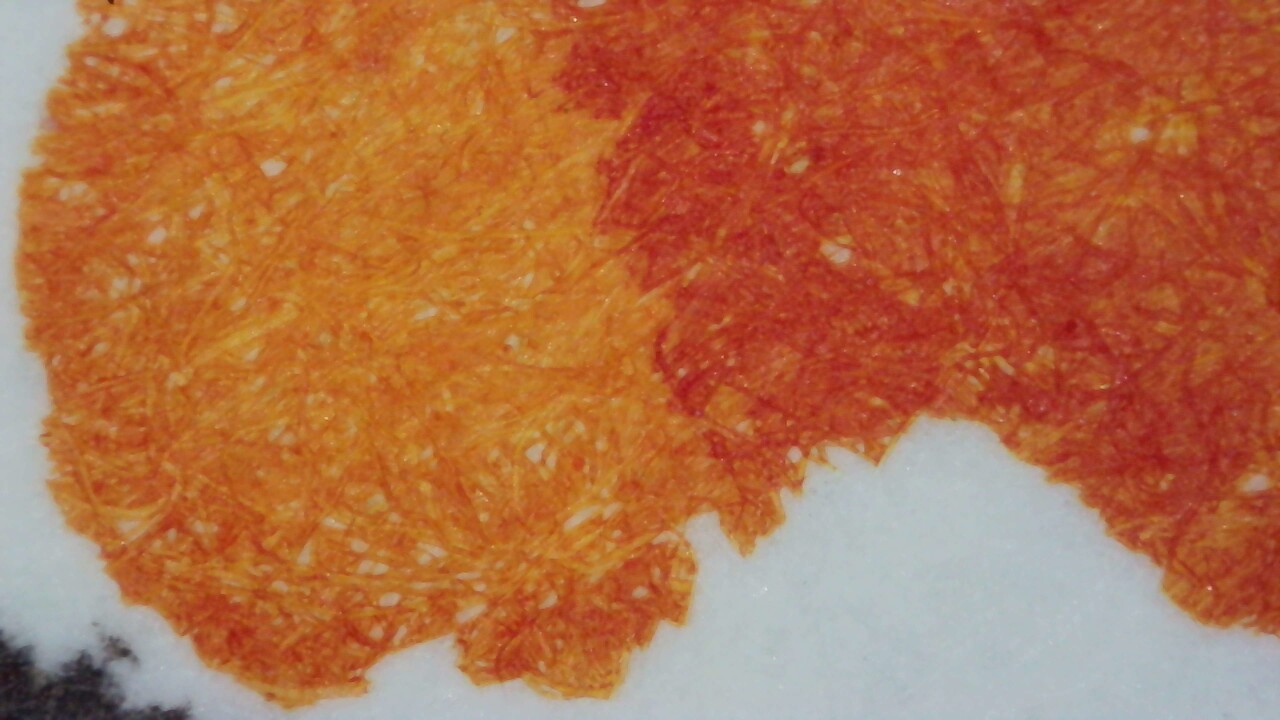
There isn’t anything too exciting showing through under magnification. The shading does look interesting, at least.
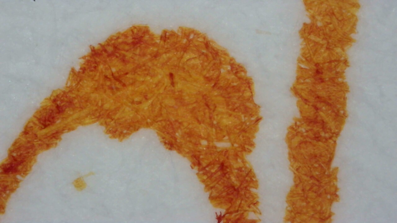
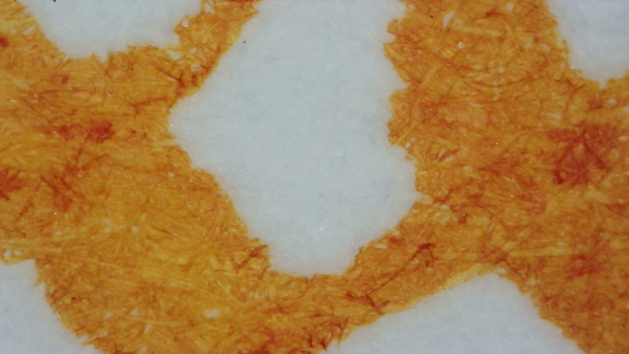
Life on Mars under Magnification. Click to enlarge.

Chromatography

The chromatography looks a bit like a narrow flame, going quickly from yellow to dark red-orange at the leading edge.

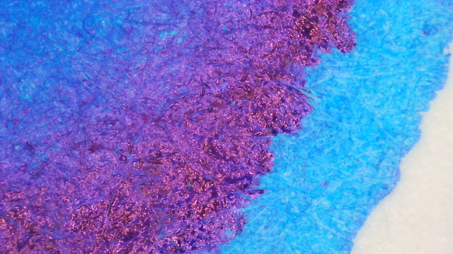
Photo of chromatography paper under UV light.
Chromatography strip photo under UV light

There is a bright orange glow at the edge and a fainter glow in the open area behind there.

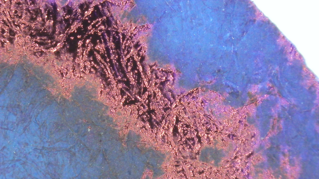
UV Check
Swatch Card Photos under visible and UV light. Click to enlarge.

It does glow under UV, like a brighter version of itself. It isn’t too bright, but it’s definitely there.

Group Photo

As there is no sheen or other light trickery happening, the group photo doesn’t look all that different from the scans.
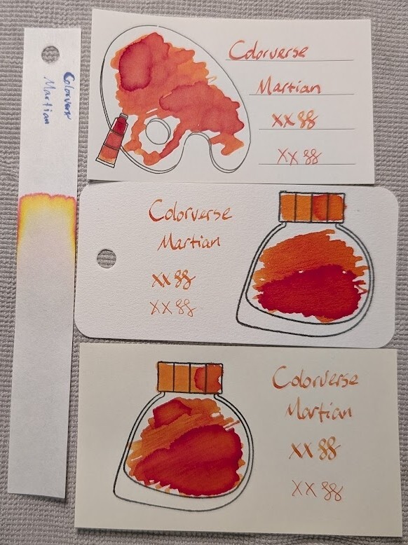
Photo of 3 ink swatches & chromatography strip for Colorverse Martian which is a orange-red colored ink with shading.  Each swatch contains the ink name followed by "XX" 2 curlicues in both stub and EF widths.  Swatch 1: Iroful swatch card with an outline of a paint palette and tube. The palette is mostly filled in with swirls of ink, a few areas are darker with even darker edges. There is an outline of a paint tube which is swabbed and looks similar. The writing has some shading across most letters, which has a pleasing appearance.  Swatch 2: Col-o-ring swatch card with a stamped outline of a Colorverse ink bottle, which is teardrop-shaped with the point at the bottom left. The outlined area is mostly full of an ink blob which is darker at the bottom and paler at the top in a two distinct sections. Swab across "cap" is similar, but not as dark. Again, the words in the sample have pleasant shading.  Swatch 3: Midori MD swatch card with a stamped outline of a Colorverse ink bottle. The outlined area is mostly filled in with swirls of ink, a few areas are darker with even darker edges. Swab across "cap" is similar. As with the others, the text has nice shading.  Chromatography is barely visible until the end, there is a band of yellow that gradually gets darker toward the leading edge. There is a thin band of red ahead of the yellow at the edge. There is a tiny halo of pink beyond the red.

See Also

Check out the other two samples in this group:

Verdict

It’s decent, but I prefer the color of Supergiant and Red Horizon from last year’s Colorvent.
Based on a Mastodon Post

Updated:


Questions or comments? Contact me on Mastodon