Here is Vanness Possum Pie (aka Possom Pie/Opossum Pie, etc.), their limited edition Thanksgiving 2025 ink. I received a 5ml sample of this with a recent order.

It’s dark brown with some shading and a tiny hint of greenish sheen if you can make it put down a lot of ink. It’s not a bad shade of brown/sienna. The sheen in the large swatches doesn’t show in the writing at all, which is good because it’s not exactly pleasant. (I’m also glad it is not scented!)

It is very dry! On Col-o-ring it was struggling to put down a line on the thin angle of the stub nib. Looks much nicer on Iroful. Midori was OK.

Scans

The scans are fairly true to color here. The photos below are a bit lighter.
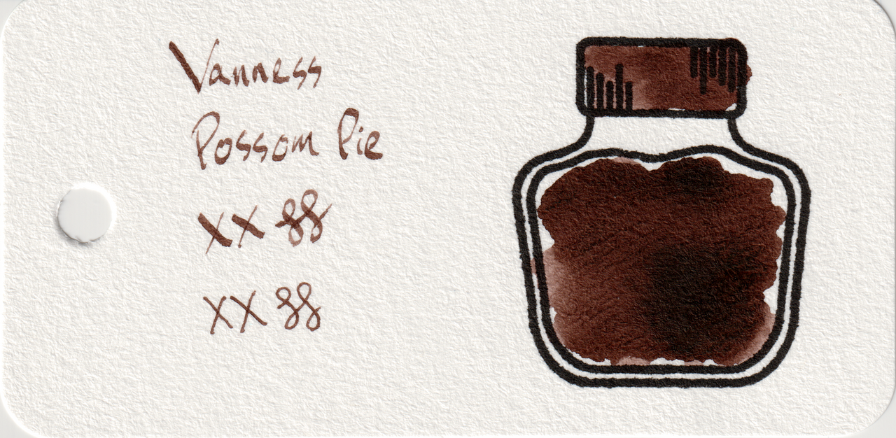
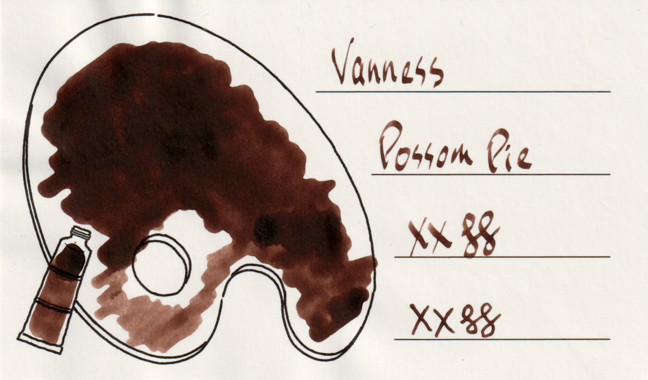
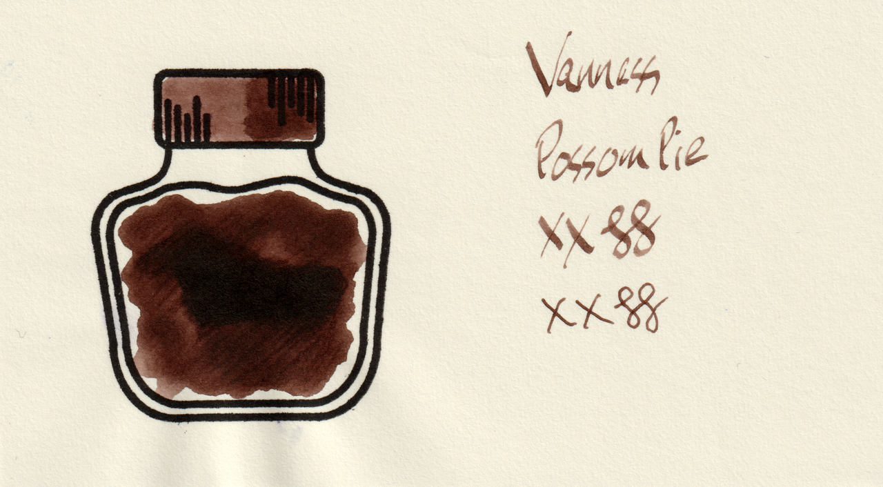
Scan of an ink swatch card made from Col-o-ring paper Scan of an ink swatch card made from Iroful paper Scan of an ink swatch card made from MD paper
Swatch Card Scans. Click to enlarge.

I copied the name exactly from the sample tube label thinking they misspelled it on purpose, but on their website it’s “Possum Pie” and I quote “we know it misspelled” (sic) 😆

Photos

In this photo you can see a little bit of the sheen.
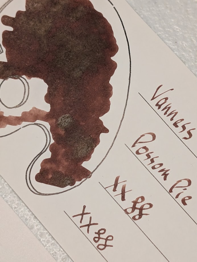
Photo of an Iroful swatch card taken at an angle. It has a writing sample and outline of a palette filled with ink. The ink inside the palette is dark brown with some lighter and darker areas. The darker areas are slightly reflective.  The writing sample reads "Vanness Possom Pie" written with a stub nib followed by "XX" and two curlicues written in a stub nib and an F nib. The ink in the writing sample is more of a medium brown with some areas shaded darker.

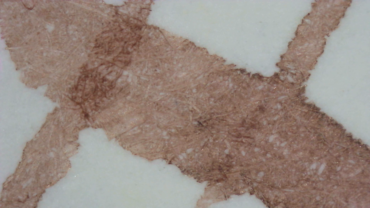
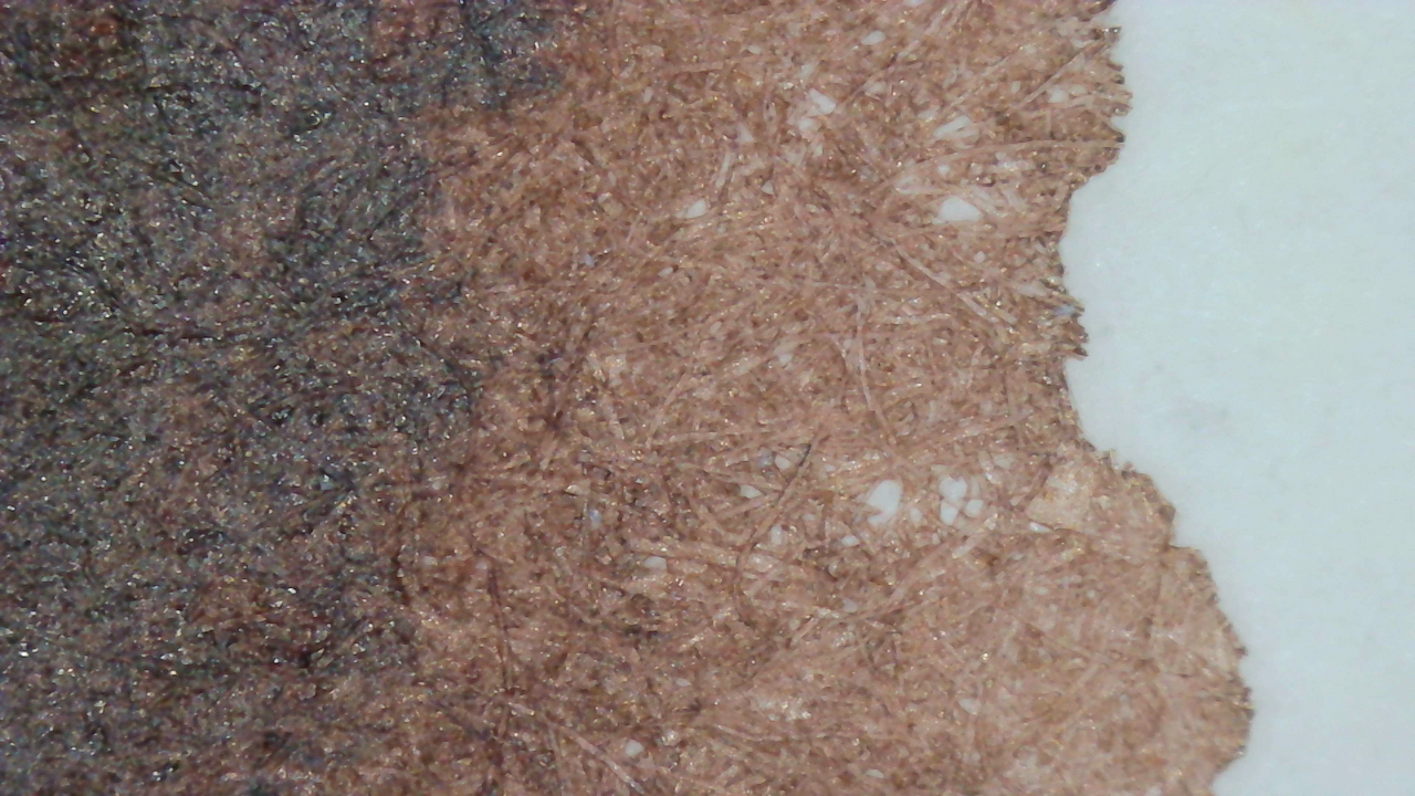
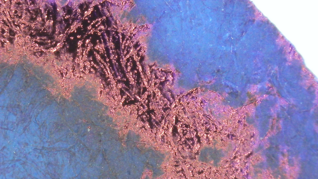
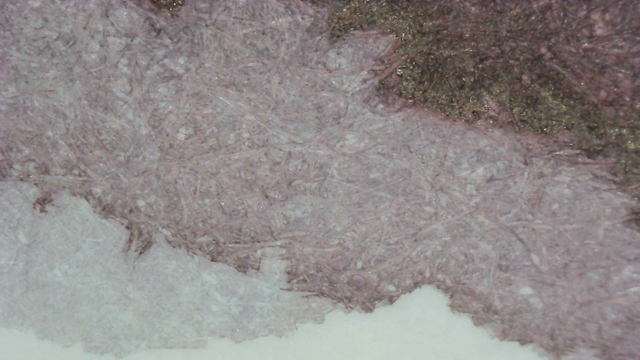
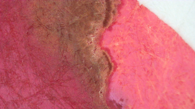
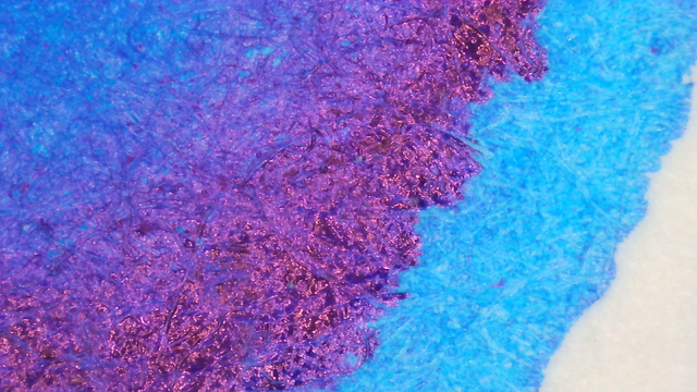
Microscope

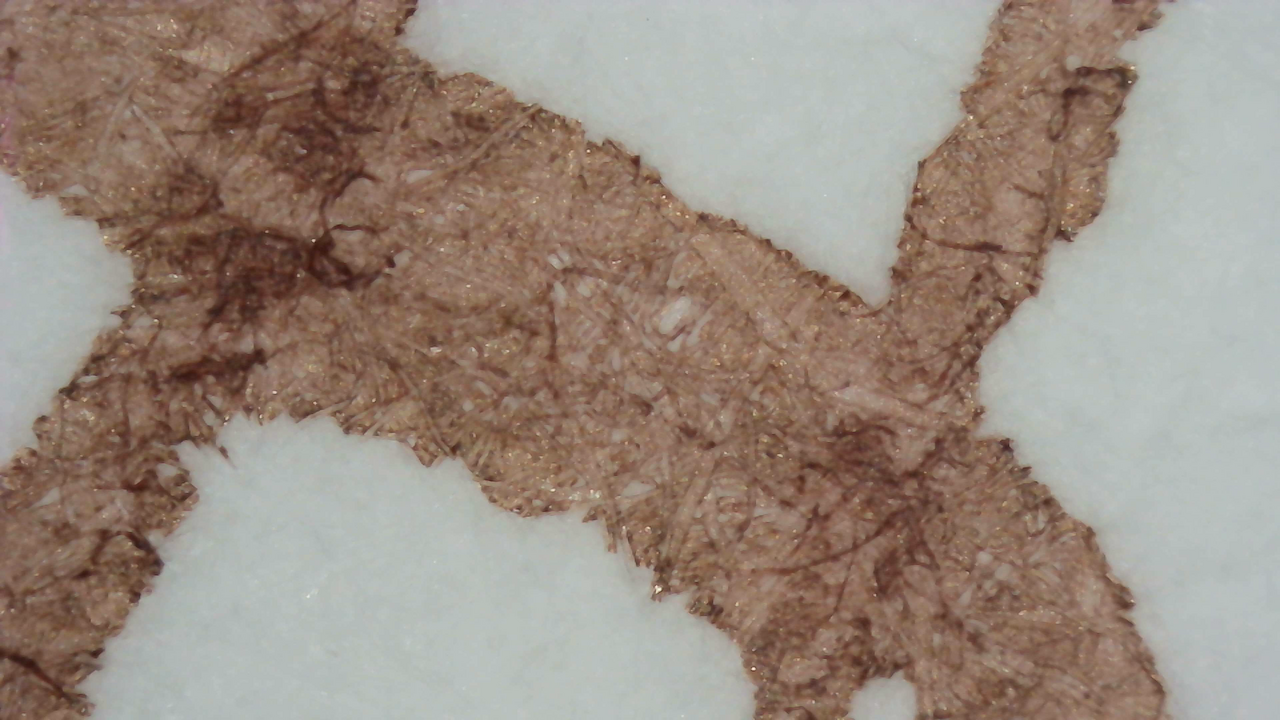
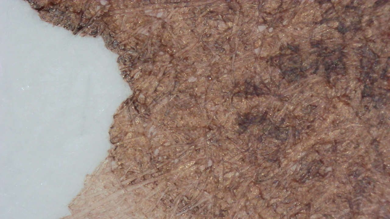
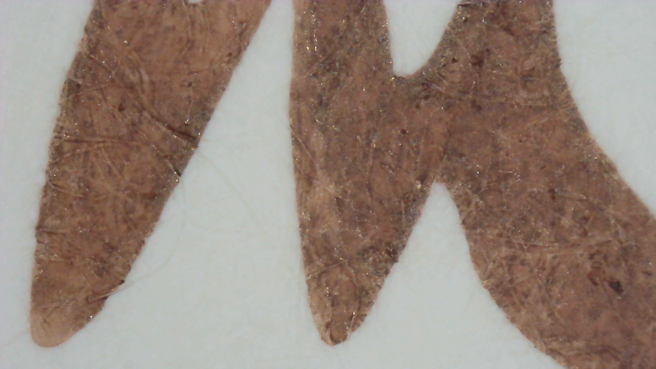
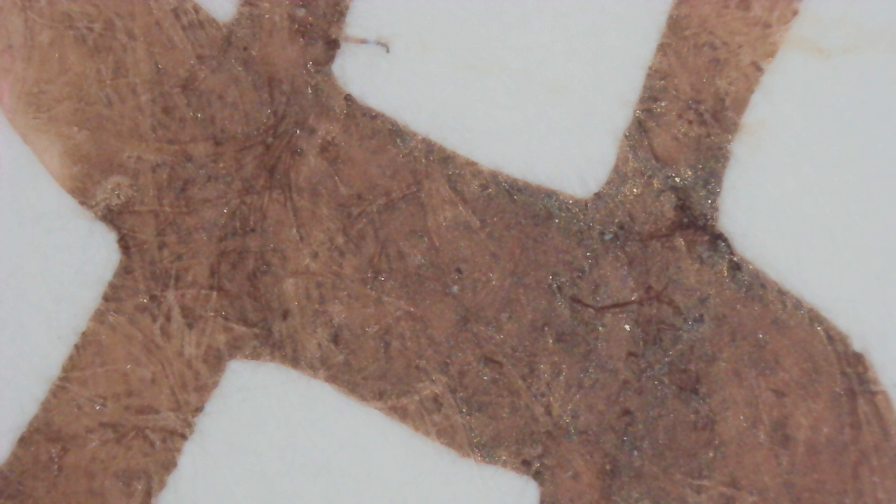
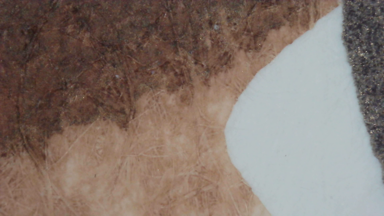
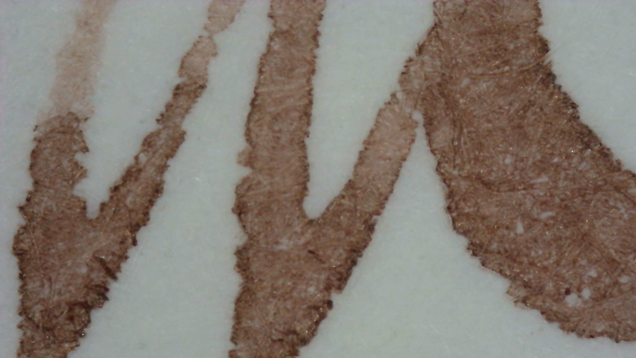
You can tell in the microscope photos that the ink goes down a bit thin and light overall.
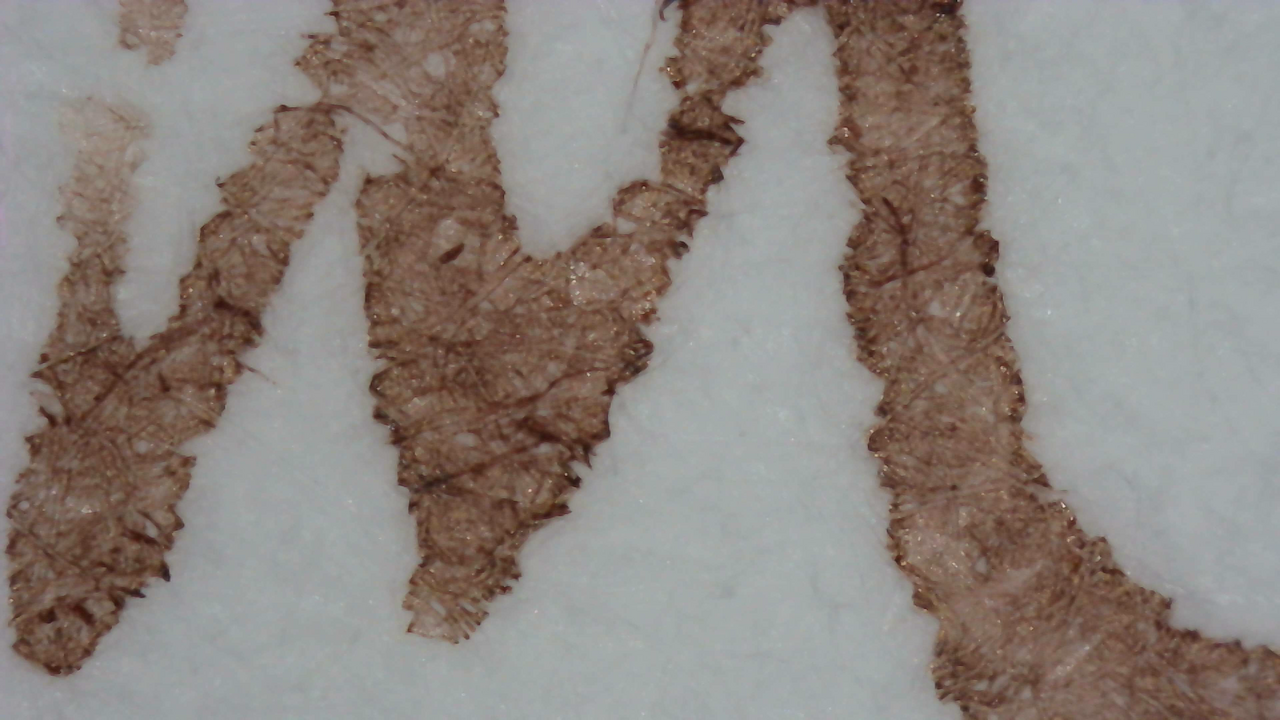
Ink under Magnification. Click to enlarge.

There is some shading on Midori. Iroful does more of a gradient instead of the usual way shading happens.

Chromatography

Scan of chromatography paper.
Chromatography strip scan

The chromatography starts brown then there is an area that is very faintly pink

Photo of chromatography paper under UV light.
Chromatography strip photo under UV light

Nothing too noteworthy under UV light, but there is a slight blue halo past the leading edge.

Group Photo

The group photo is a bit lighter than it usually appears, might have been something slightly off in the light or exposure.
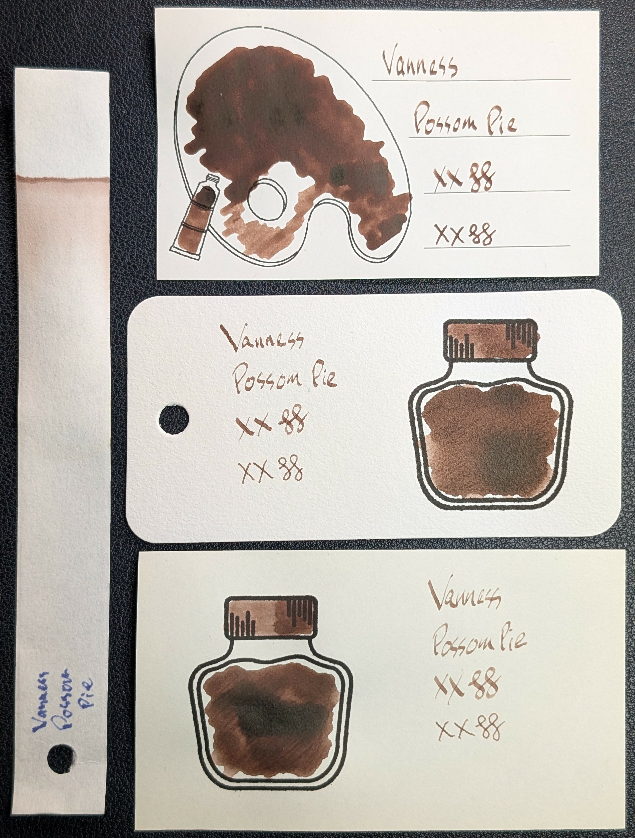
Photo of 3 ink swatches & chromatography strip for Vanness Possum Pie which is a dark brown/sienna colored ink with some shading and a some sheen only in large swatches.  Each swatch contains the ink name followed by "XX" 2 curlicues in both stub and EF widths.  Swatch 1: Iroful swatch card with an outline of a paint palette and tube. The palette is mostly filled in with swirls of ink with one area in the lower left being lighter. There is an outline of a paint tube which is swabbed and looks similar. The writing is evenly brown with thin, but dark and legible lines.  Swatch 2: Col-o-ring swatch card with a stamped outline of an ink bottle. The outlined area is mostly full of an ink blob which is dark overall with some even darker areas. Swab across "cap" is similar. The writing sample is very thin in some places, a little harder to read than Iroful.  Swatch 3: Midori MD swatch card with a stamped outline of an ink bottle. The outlined area is mostly full of an ink blob which is dark with a darker area in the middle. Swab across "cap" is similar. Text is thin and legible, but still not as good as Iroful.  Chromatography starts at a dark brown line which gradually fades out and doesn't change.

Verdict

The color is nice, but it’s not an ink I’d use regularly. Between being overly dry and having some sheen I wasn’t crazy about, it had too many drawbacks for me.
Based on Mastodon Posts 1/2 2/2

Updated:


Questions or comments? Contact me on Mastodon