
Here’s another instant favorite: Akkerman #13 Simplisties Violet. (Which I misspelled multiple times when swatching, oops)
This is closer to what I think of when “purple” comes to mind. More grape-ish and trending toward indigo. Yama-budo is hard to beat, but that’s more magenta. Both great in different ways.
The gold sheen on this is subtle, clinging mostly to the outlines of letters. It looks especially nice on Iroful.
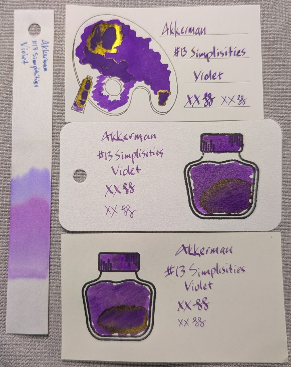
Scans
The swatch card scans don’t show the sheen, but they do show subtle differences in color on different paper.
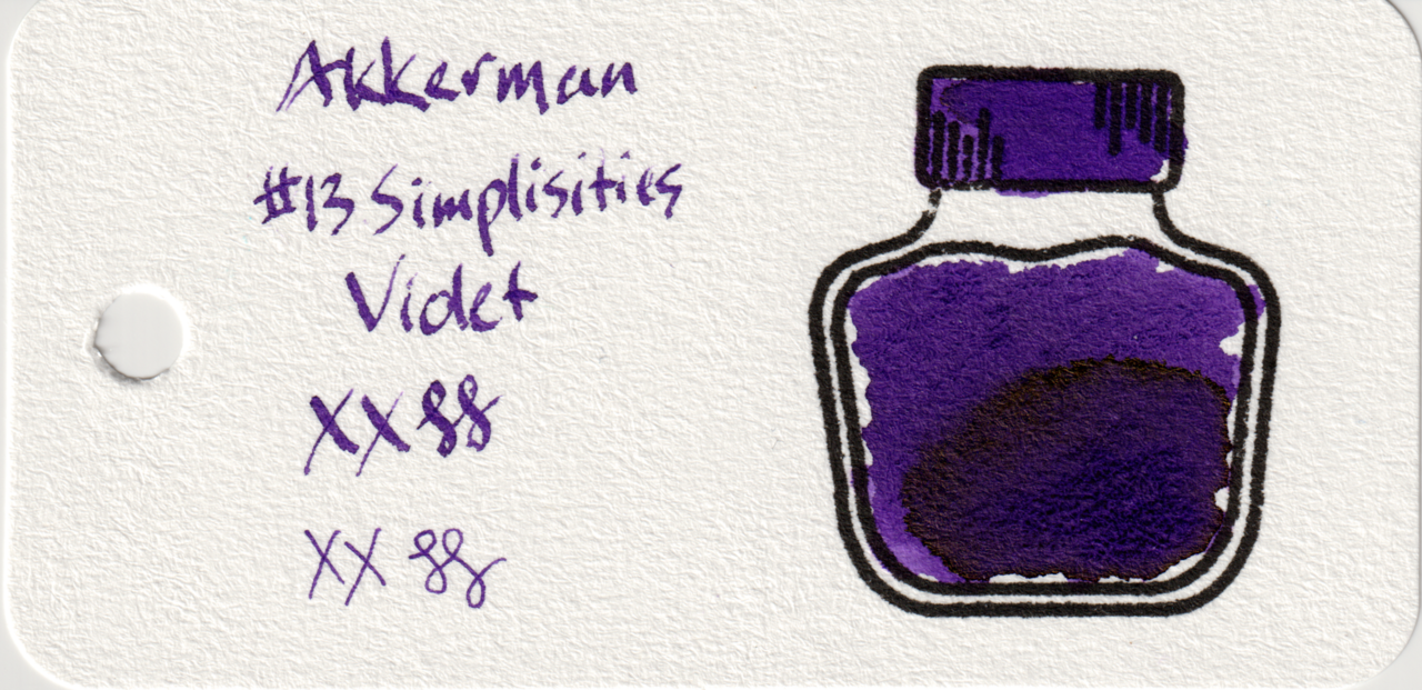
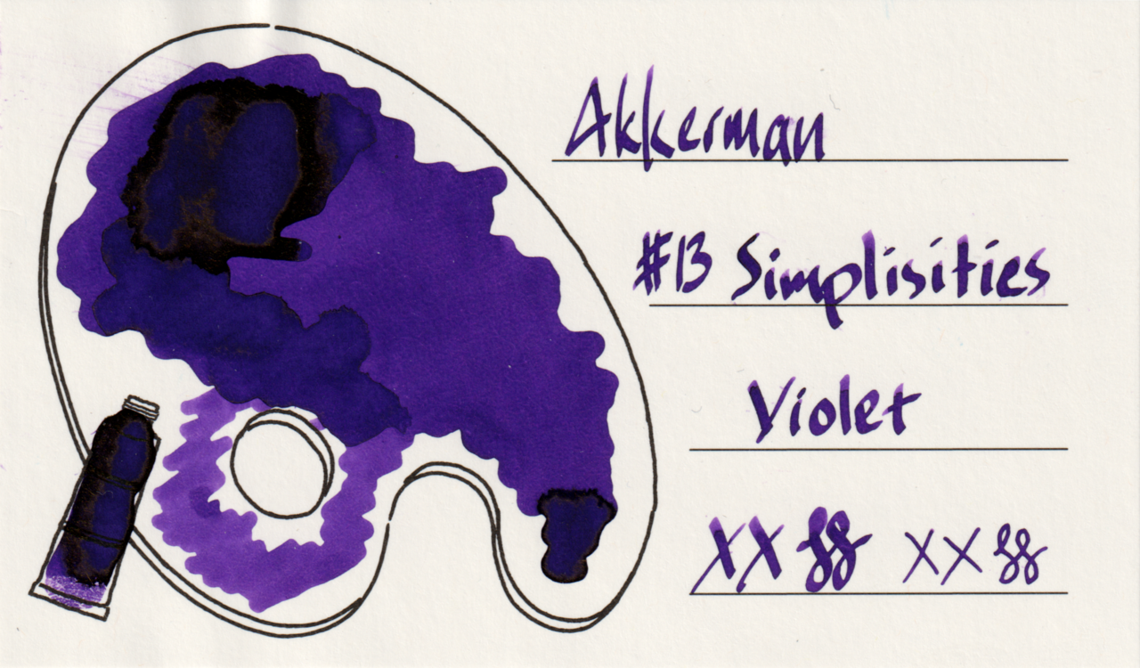
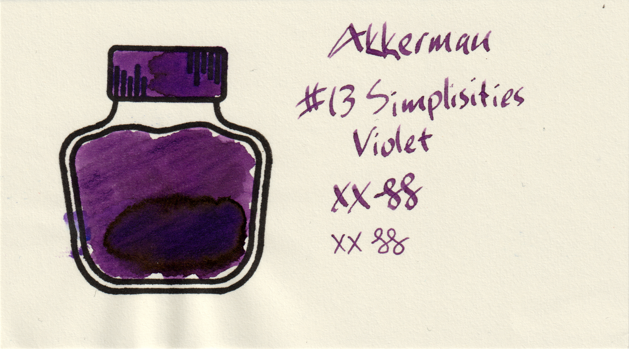
MD leans a bit more toward magenta, Iroful is more even, saturated, and darker than Iroful.
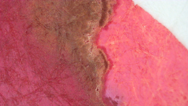
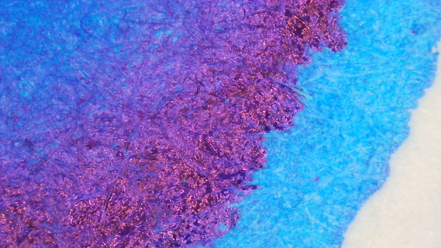
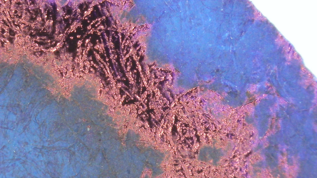
Microscope
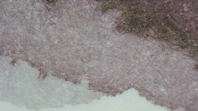
The microscope photos show the sheen around the edges on every paper type, but they are most clearly defined on Iroful
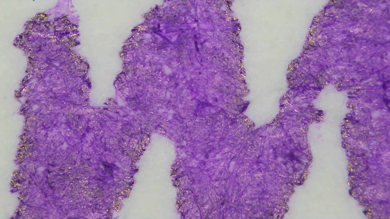
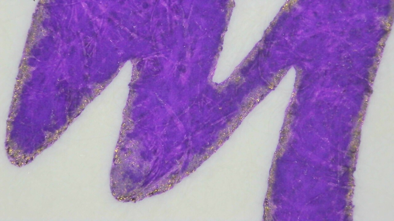
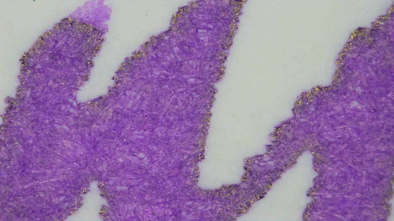
The color differences between the papers show again, and once again Iroful looks the best to me.
Chromatography
Had a little inkcident with the Chromatography strip but thankfully only on the name and not the important part.

It separates out into purple, more of a blurple, and there is a faint gold or brown line past the end.

Nothing too noteworthy under UV light, but there is a slight blue glow in the middle and a halo past the leading edge.
UV Check
While it is not a prominent effect, the ink does glow a little under UV light.
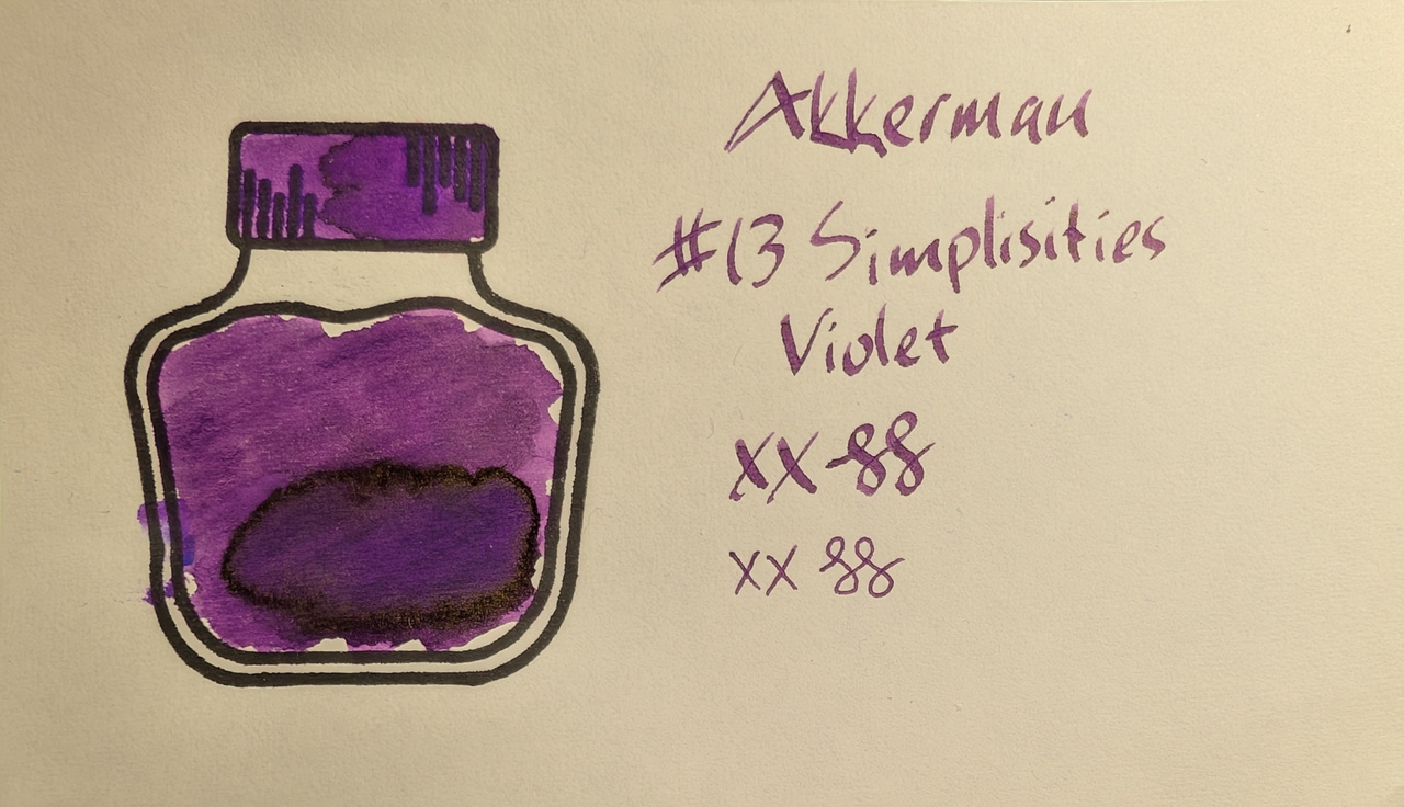
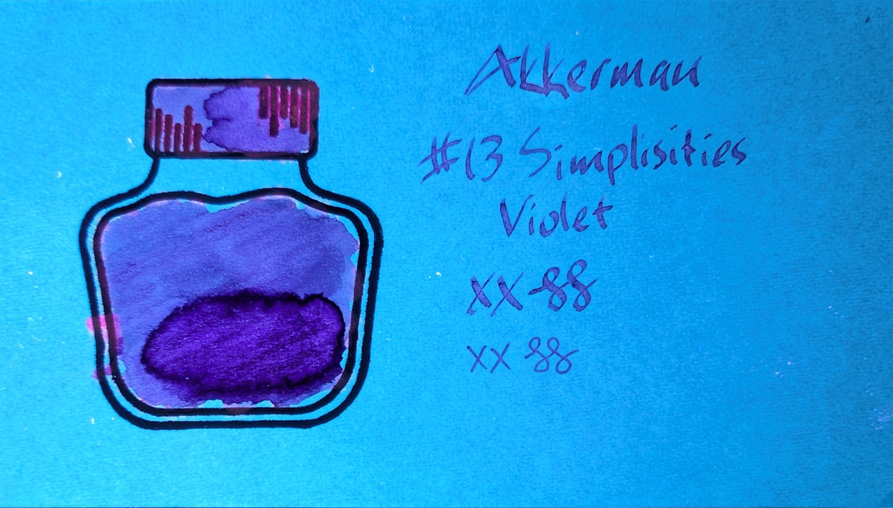
Mostly it glows purple but there are some spots of bright magenta where the ink is over stamp lines.
Group Photo
This photo is a little blurry, but shows off the gold sheen in the large swatch areas.
Verdict
I’m a big fan of the color and sheen. I’ve used it in a couple pens and it’s done well, no problems so far.
Questions or comments? Contact me on Mastodon