I found the last Tono + Lims Star Light Series fluorescent ink: Quantum. Had to order from a new shop because nobody else had it listed or in stock.

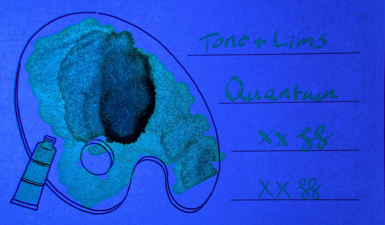
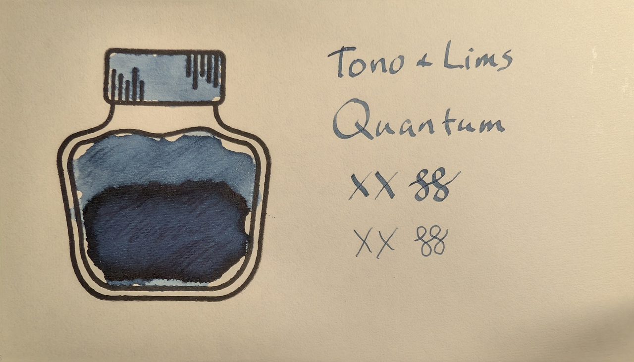
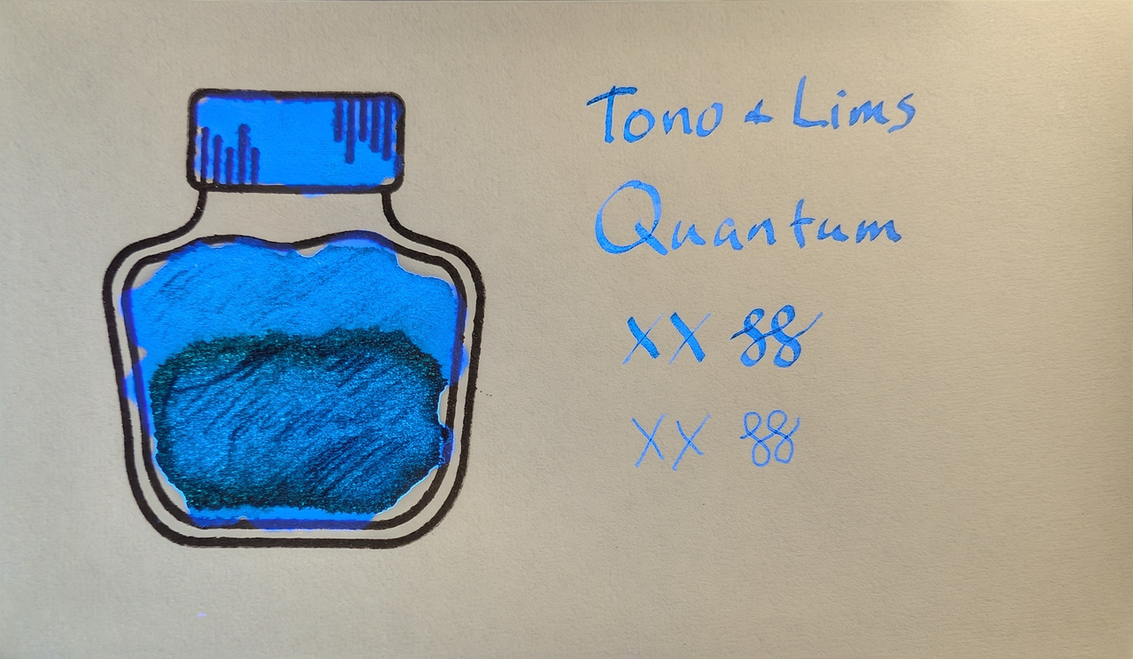
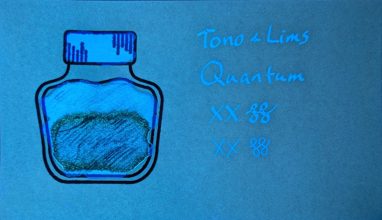
It’s sort of a dark slate teal, but there are distinct hints of both blue and green chromashading. Col-o-ring is almost all blue. Under a mix of UV and visible light it glows blue, but more teal/greenish under just UV. In some areas it glows both blue and green depending on shading!

Scans

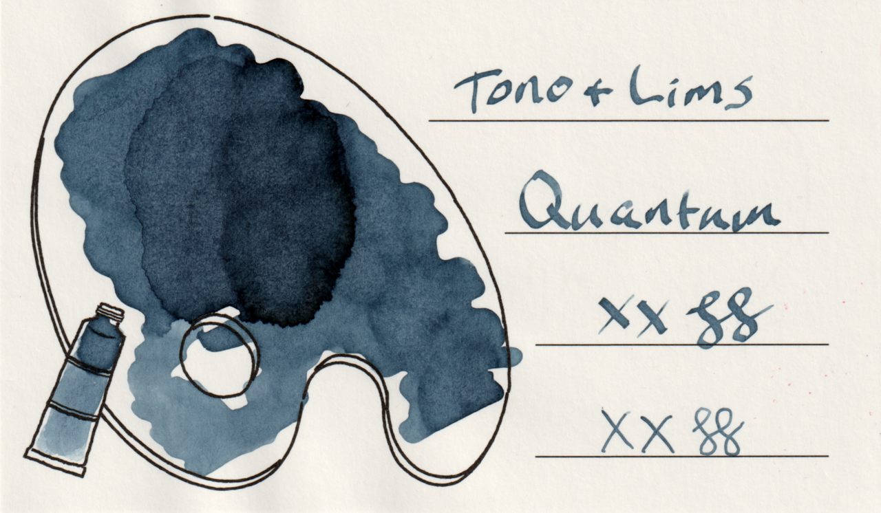
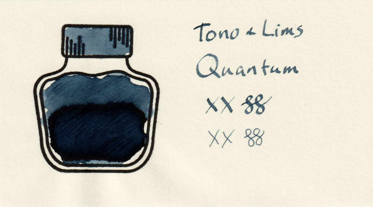
Scans are a smidge darker than it looks, but still the same dark slate teal.
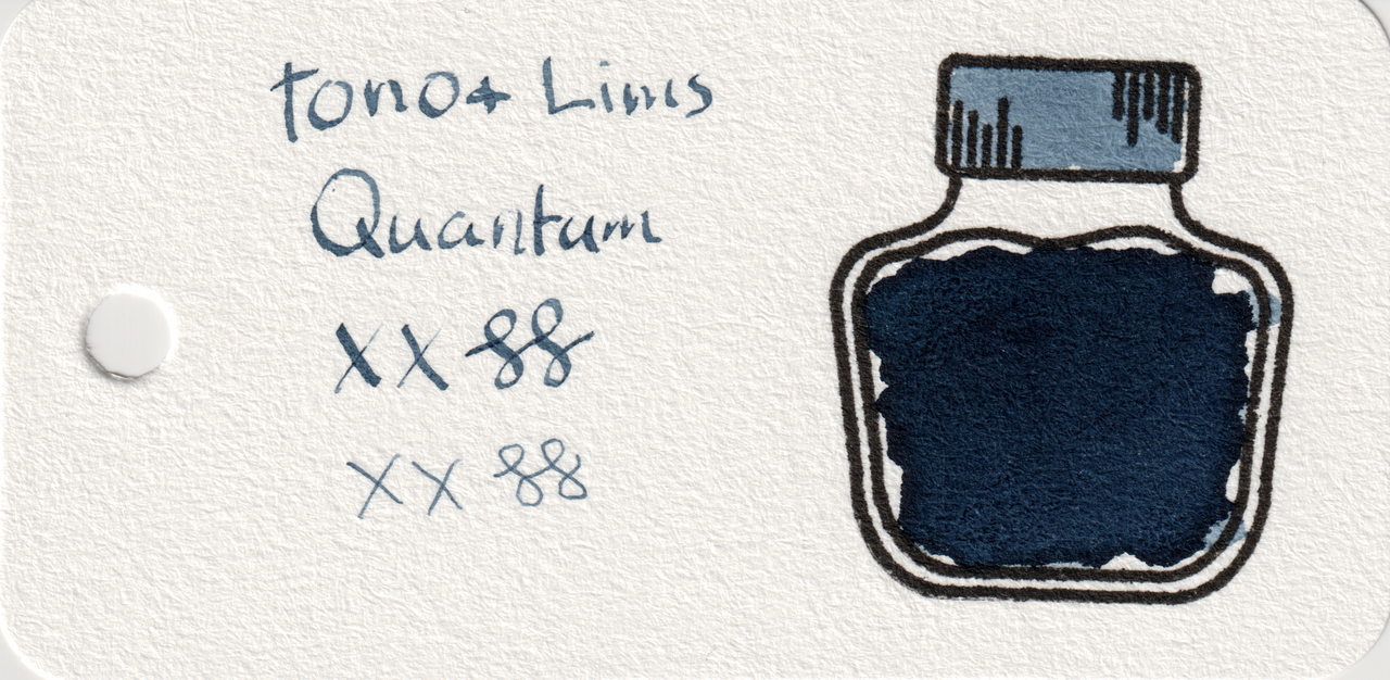
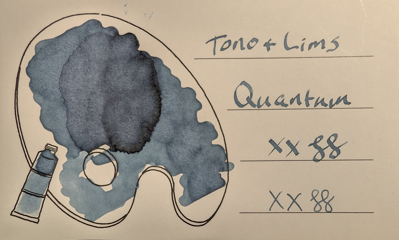
Scan of an ink swatch card made from Col-o-ring paper Scan of an ink swatch card made from Iroful paper Scan of an ink swatch card made from MD paper
Swatch Card Scans. Click to enlarge.

Photos

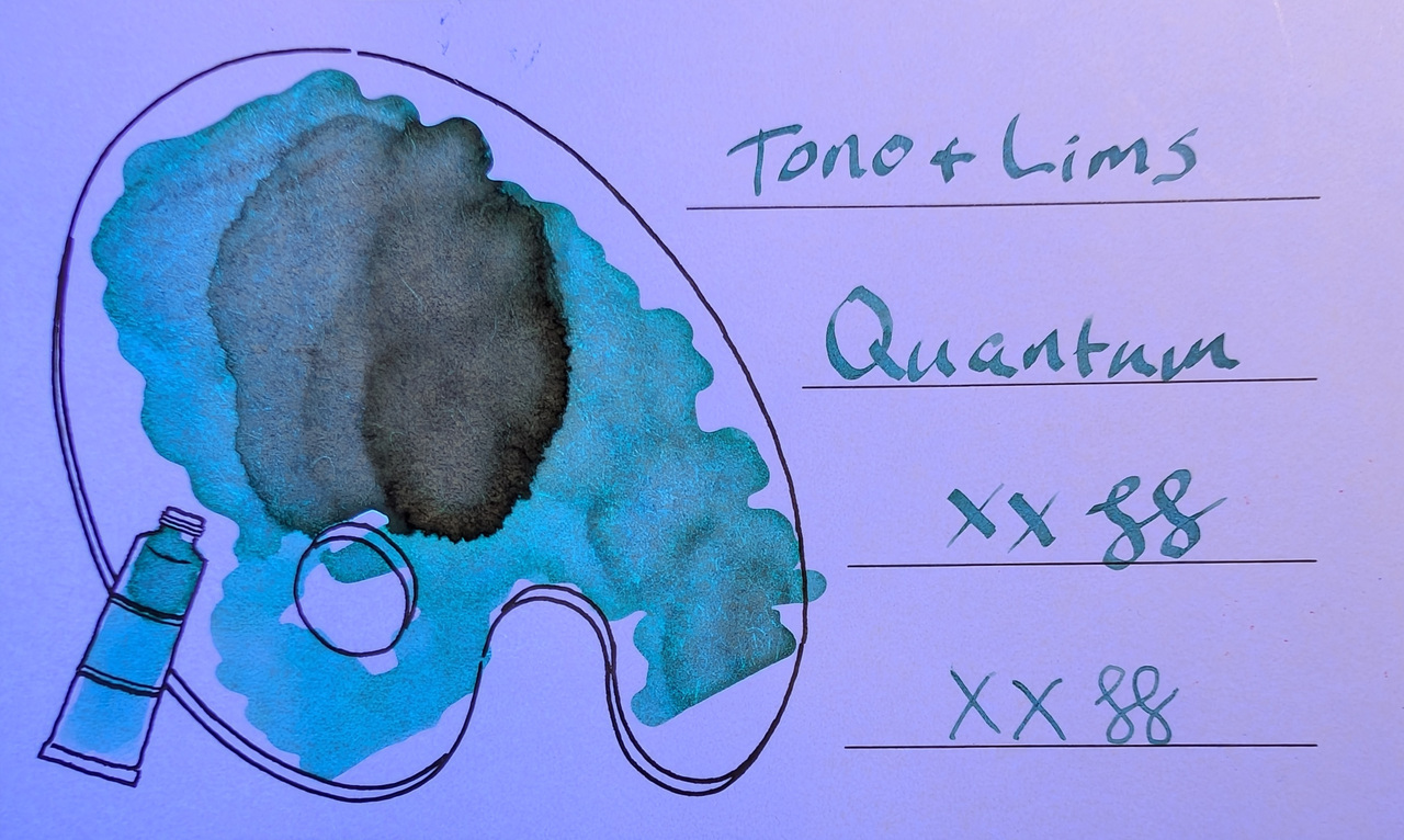
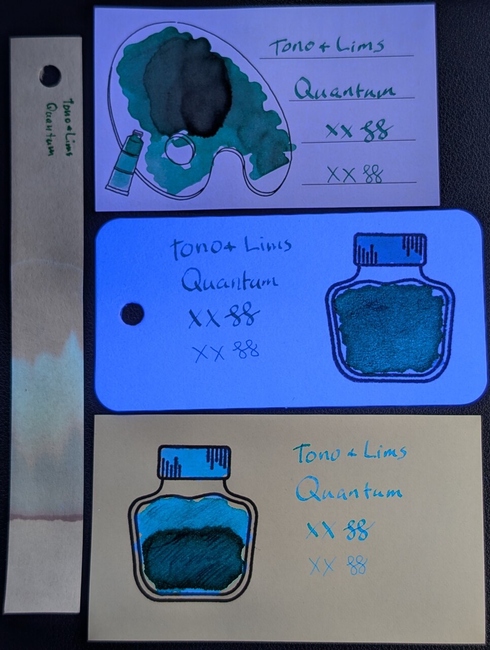
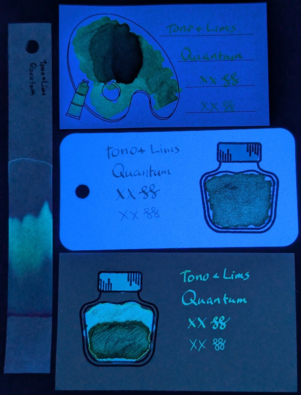
These photos show each swatch under visible light, a mix of visible and UV light, and UV light alone.
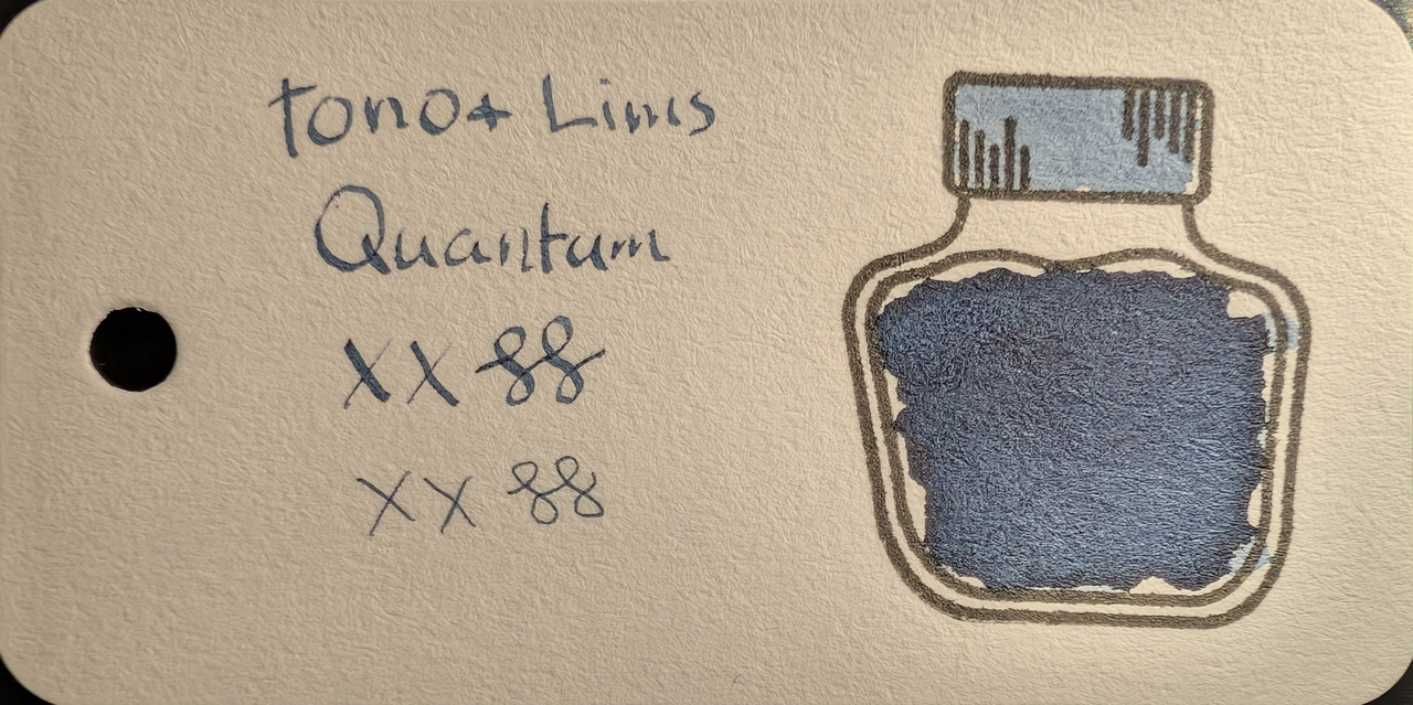
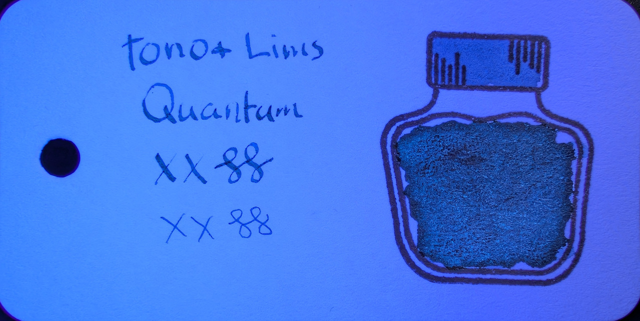
Swatch Card Photos. Click to enlarge.

Col-o-ring paper is very reactive to UV and the paper itself glows blue brightly, which makes the glow of the ink appear less intense. Iroful is mildly reactive to UV and glows a little. MD reacts very low so it shows off the glow of the ink the best.

A mix of UV and visible light seems to yield the best results to the eye.

On Iroful the glow is quite green, while on MD it is very blue. The separation between blue and green is more distinct in some places. Is it enough to call it chromashading/multishading? Color-shifting? Not sure, but it’s neat.

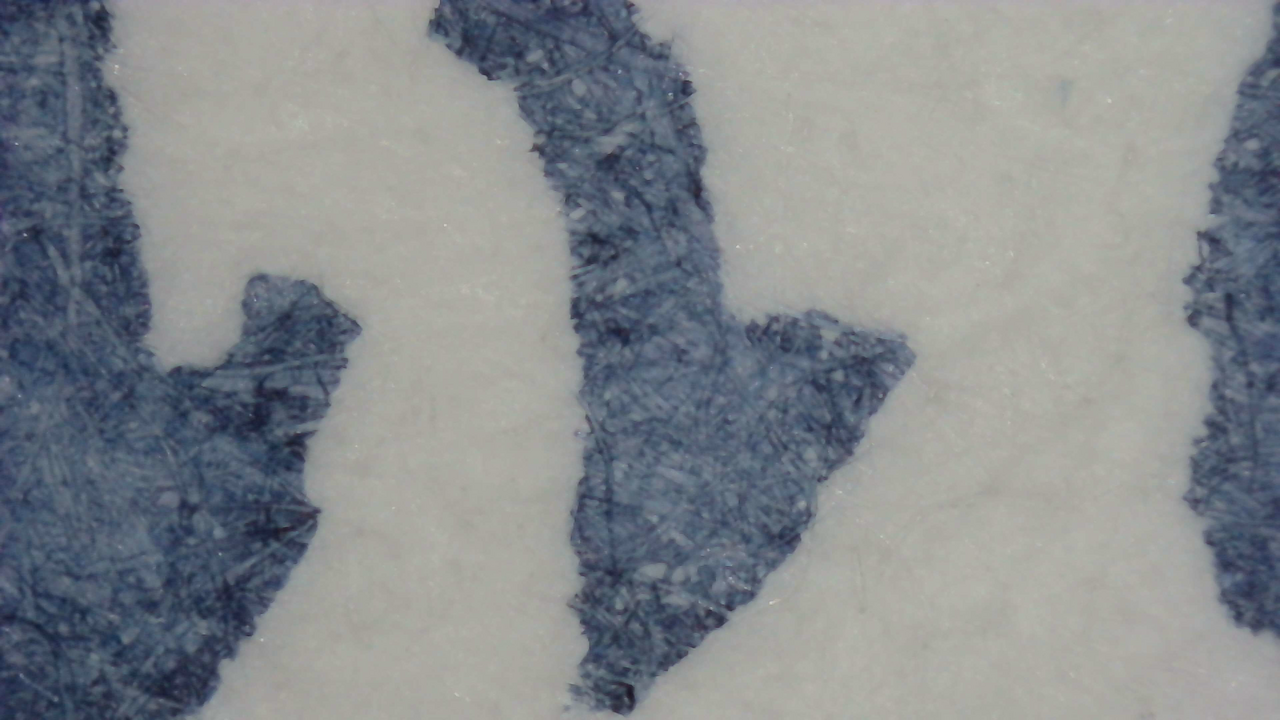
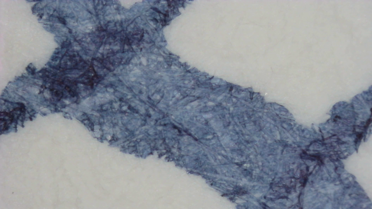
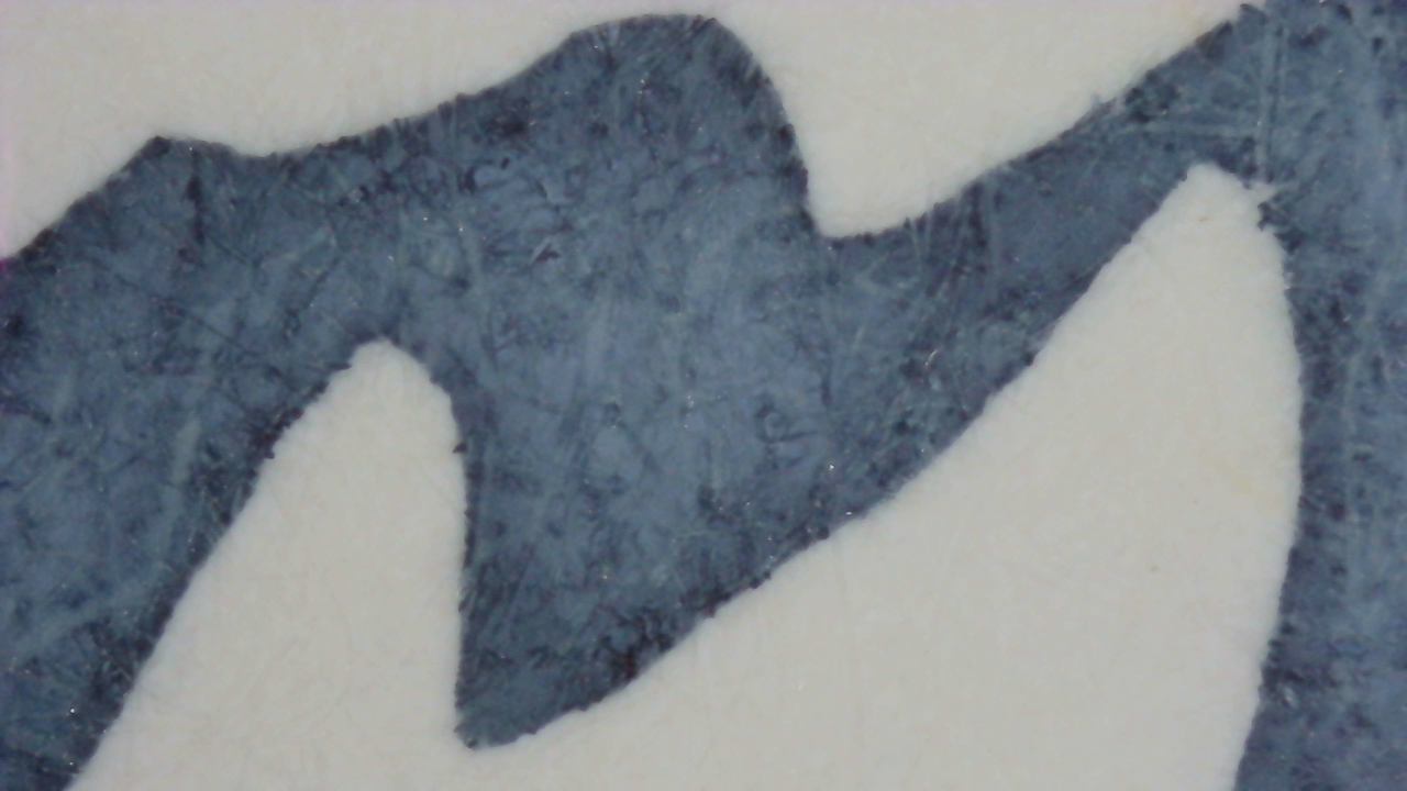
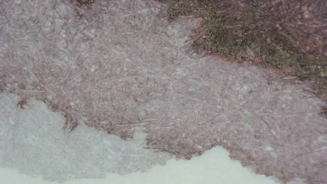
Microscope

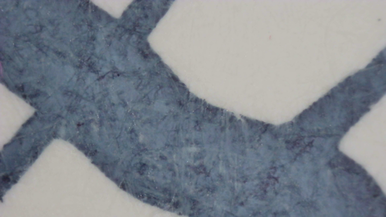
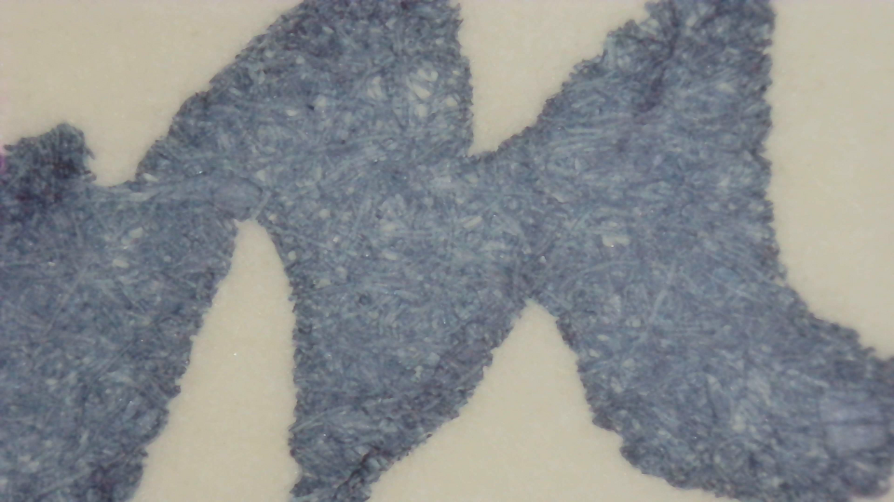
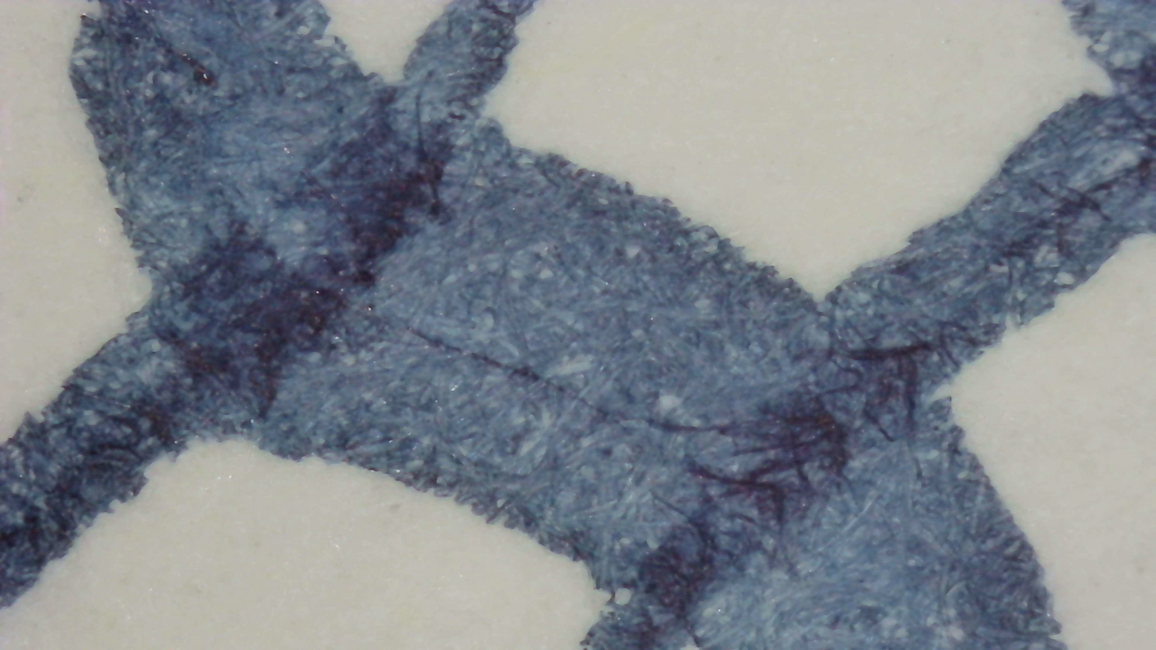
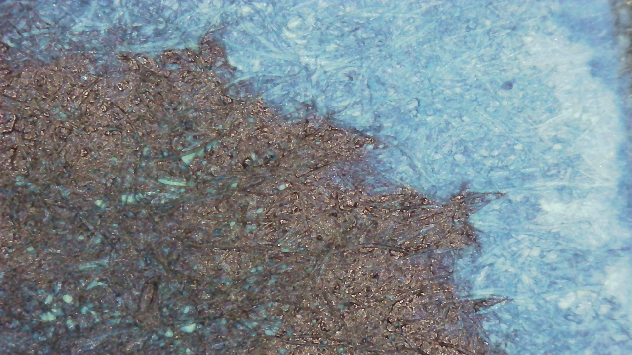
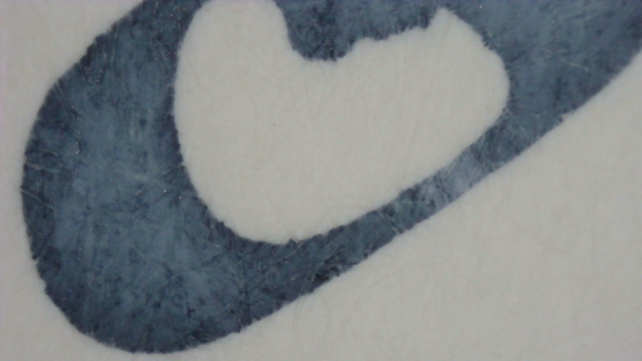
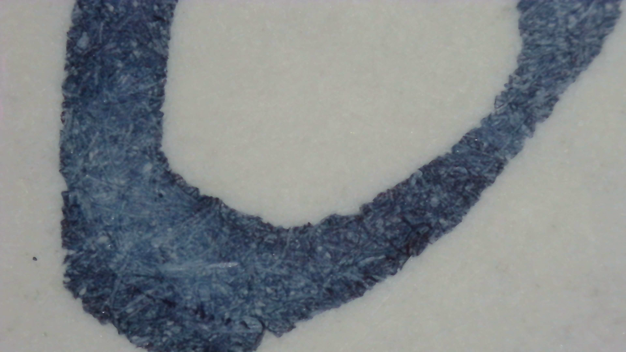
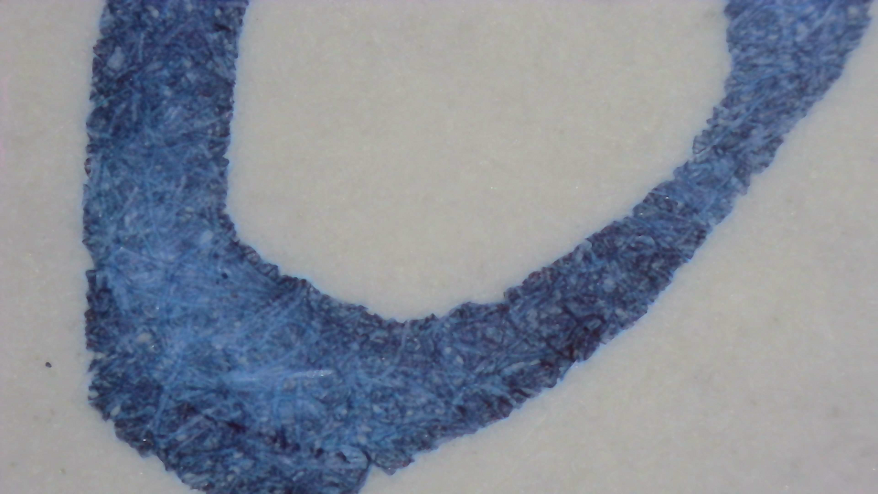
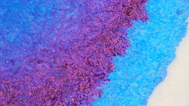
Under magnification there isn’t a ton of difference between the color on each paper, it’s maybe a little more evenly saturated on Iroful.

Ink under Magnification. Click to enlarge.

The heavy areas on the larger swatch have more variation depending on how the ink settled.

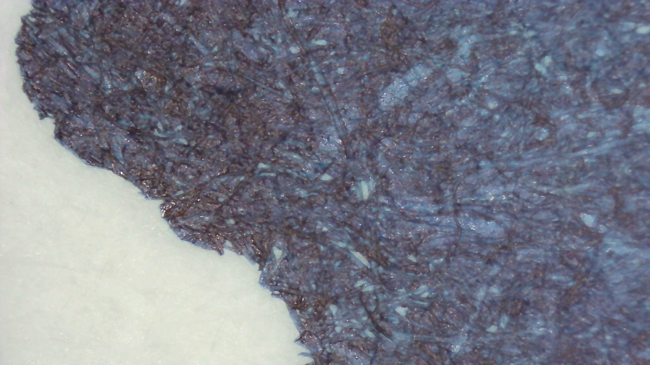
Microscope UV

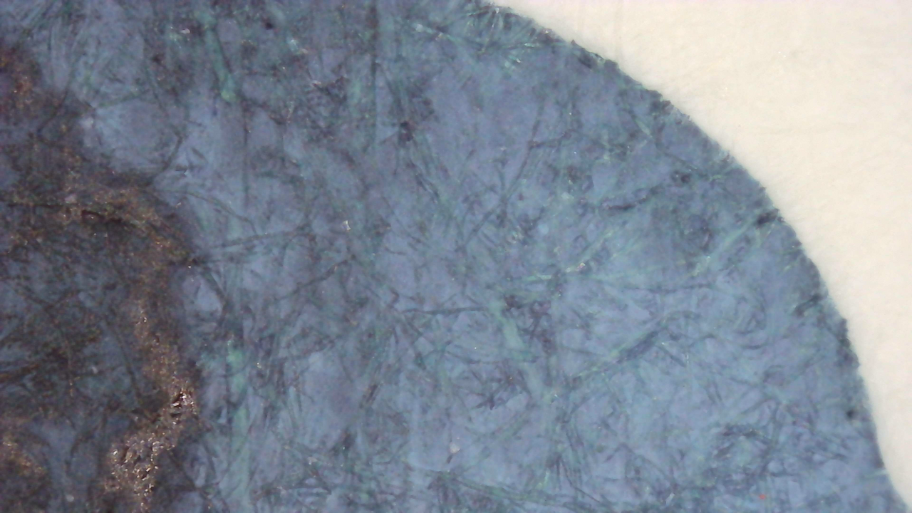
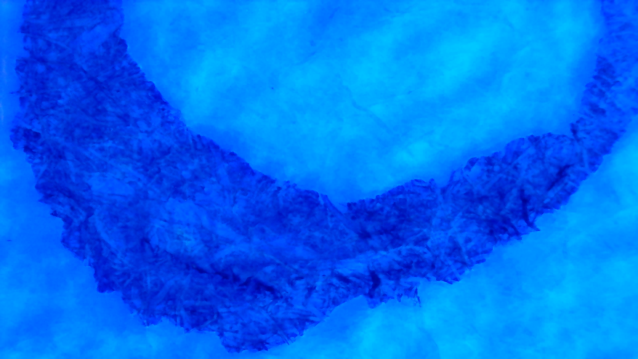
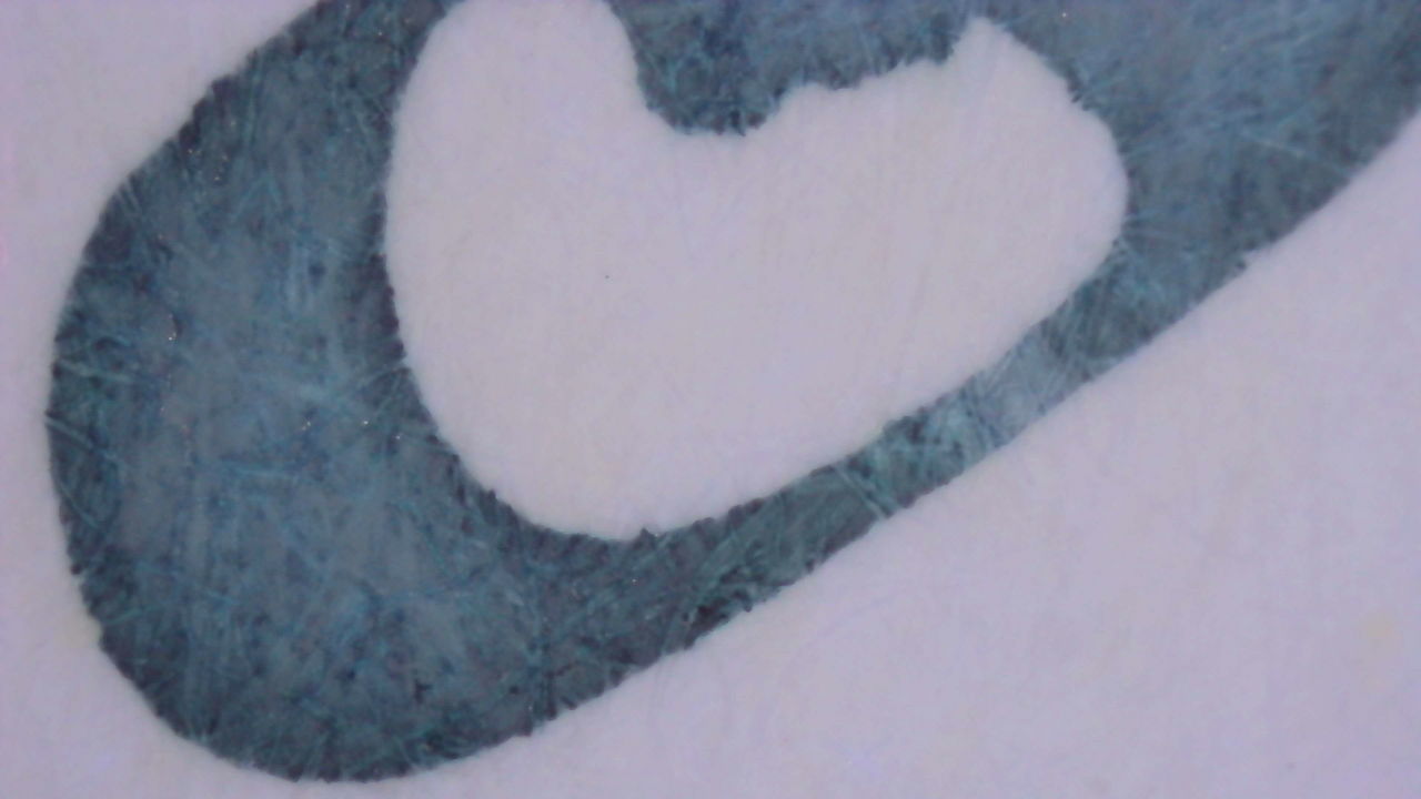
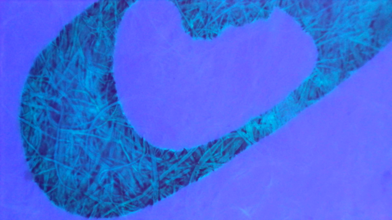
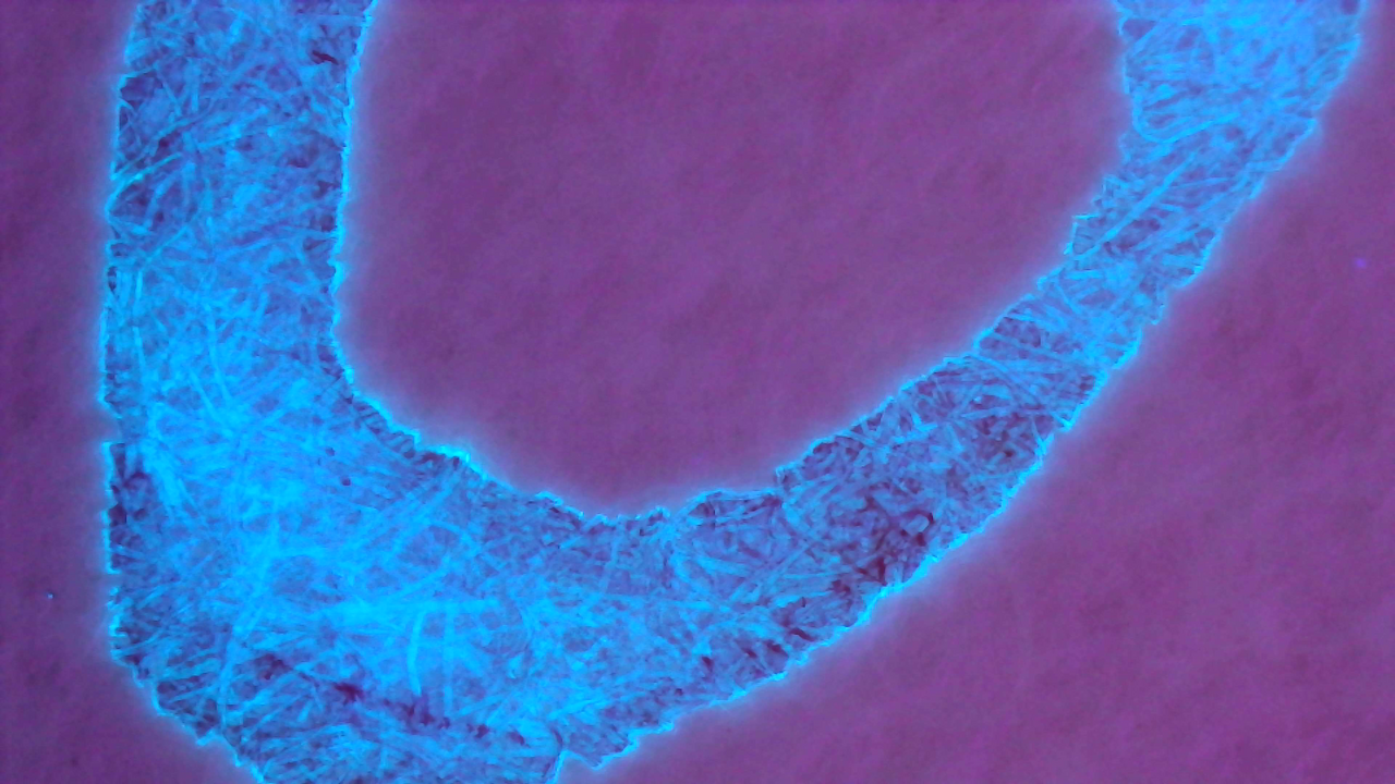
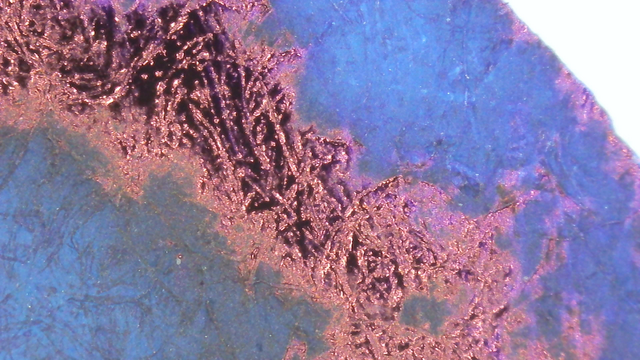
These photos show magnified portions of each swatch under visible light, a mix of visible and UV light, and UV light alone.
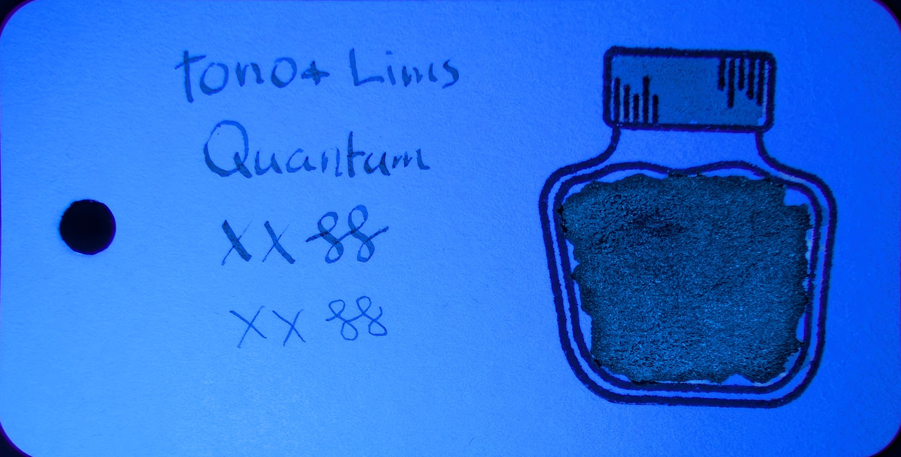
Microscope UV photos are a bit tricky since I have to dial the light up/down on the microscope and add UV light from a flashlight. As the UV light intensifies, it seems to play tricks with the microscope’s camera with the background to some extent.
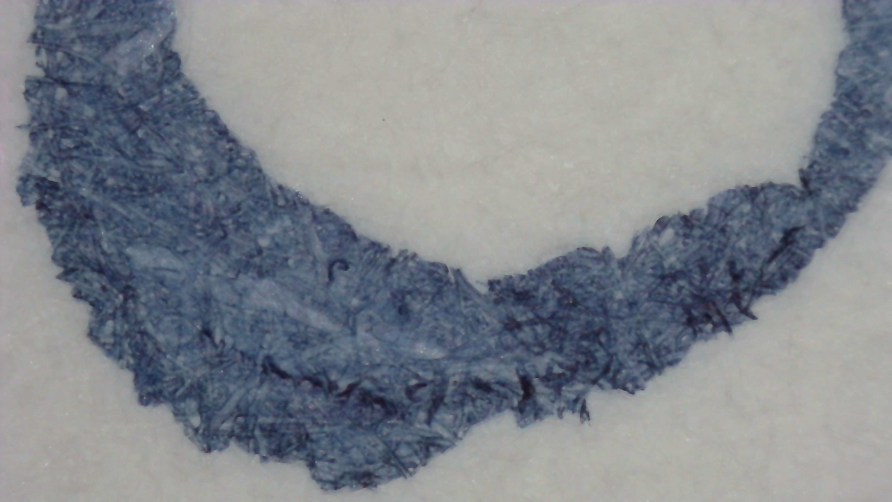
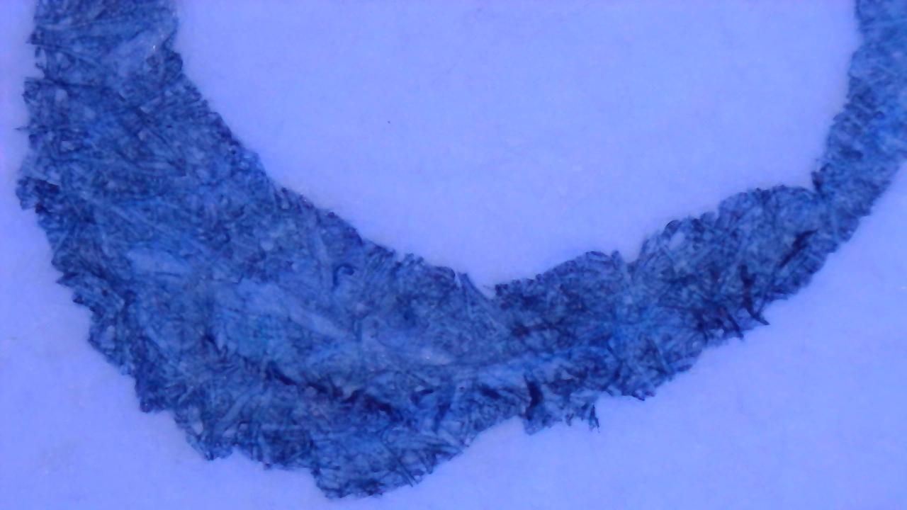
Ink under Magnification with UV Light. Click to enlarge.

Similar to the photos, the glow is more blue on MD and green on Iroful.

Chromatography

Scan of chromatography paper.
Chromatography strip scan

The Chromatography is fairly sparse here, it starts with some purple that fades into a dusty cyan, then a wide open space and a faint line far across the strip.

Photo of chromatography paper under UV light.
Chromatography strip photo under UV light

Most of the open area in the center is glowing blue but there is a faint purple glow just beyond that and a thin blue glow far past that portion.

Group Photos
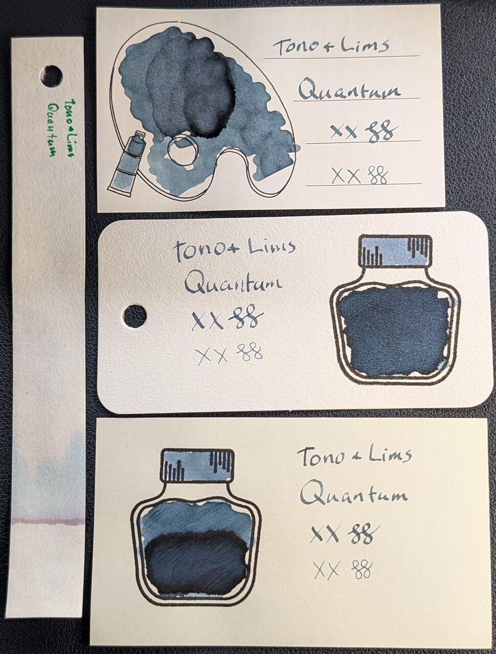
Photo of 3 ink swatches & chromatography strip for Tono & Lims Quantum which is a medium slate blue-leaning teal fluorescent colored ink with some shading.  Each swatch contains the ink name followed by "XX" 2 curlicues in both stub and EF widths.  Swatch 1: Iroful swatch card with an outline of a paint palette and tube. The palette is mostly filled in with swirls of ink and one area near the middle that is a bit darker and more blue. There is an outline of a paint tube which is swabbed and looks similar. The writing is readable and even with some shading on a few letters.  Swatch 2: Col-o-ring swatch card with a stamped outline of an ink bottle. The outlined area is mostly full of an ink blob which is evenly dark slate blue and less green. Swab across "cap" is a pale slate blue. The writing sample is spotty in places, but also dark slate blue.  Swatch 3: Midori MD swatch card with a stamped outline of an ink bottle. The outlined area is mostly full of an ink blob which is lighter in the top half and darker in the bottom half. Swab across "cap" is lighter like the top of the bottle. Text is similar to Iroful but darker.  Chromatography starts with a purple line and quickly fades to light blue and then to nothing. Same as the last photo but under a mix of visible and UV light.  The Iroful paper is glowing slightly and the ink swatch is glowing teal.  The col-o-ring paper is glowing brightly and the ink in the bottle is glowing greenish, the cap is glowing light blue, and the text is glowing more blue.  The Midori paper is not glowing, and the ink is glowing medium blue in the text, bottle cap, and top of bottle, while the bottom of the bottle is glowing more teal/green.  The chromatography strip has a dim greenish glow extending far past the end of where the blue was in the previous photo. Same as the last photo but under primarily UV light.  The Iroful paper is glowing and the ink swatch is glowing green.  The col-o-ring paper is glowing very brightly and the ink in the bottle is glowing greenish, the cap is glowing light blue, and the text is glowing more blue.  The Midori paper is not glowing, and the ink is glowing teal/greenish in the text and top of bottle, the bottle cap is more blue, while the bottom of the bottle is glowing even more teal/green.  The chromatography strip has a greenish glow extending far past the end of where the blue was in the previous photo, and a slight halo of light blue going even farther than the green.
Group Photos. Click to enlarge.

Shows a good direct comparison for the UV reaction of different papers. In this view, it also appears to change from blue to green on MD when the UV changes from a mix to full UV light.

Verdict

The color in visible light is nice enough on its own, but under UV it’s wonderful. The color-shifting is rather neat, even if that makes it somewhat unpredictable.
Based on a Mastodon Post

Updated:


Questions or comments? Contact me on Mastodon